
Project 13 · Independent title study
FOUNDATION Structure to symbol.

A title built as an environment, then reduced to its essential signal.
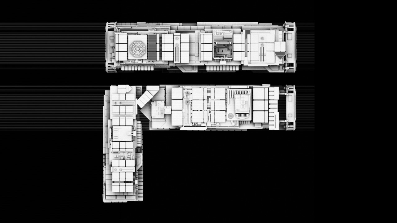
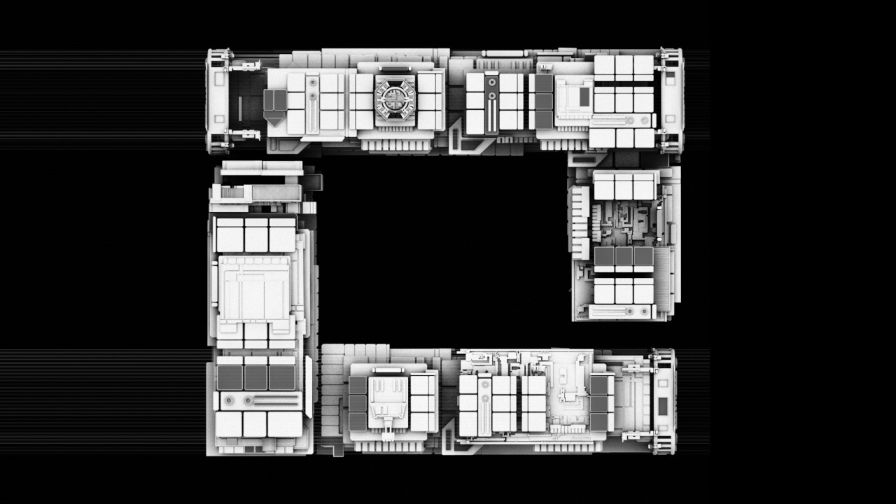
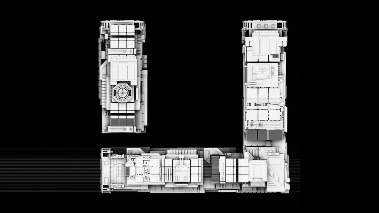
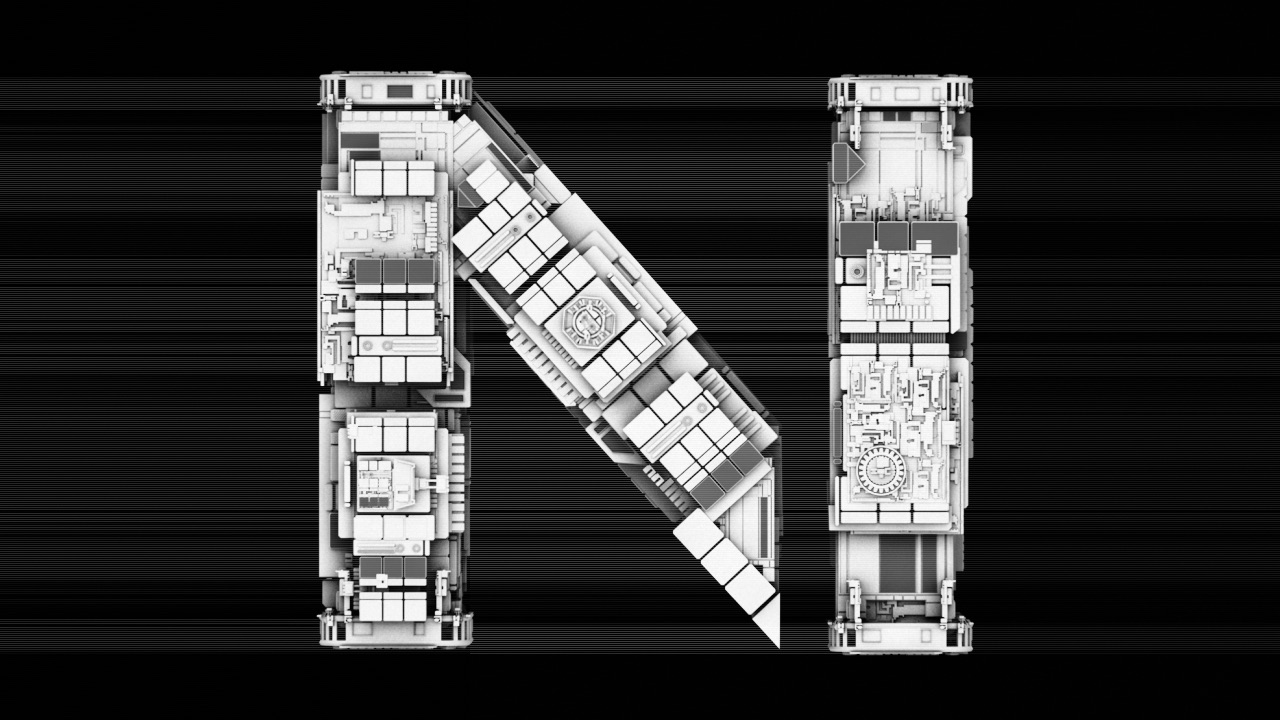
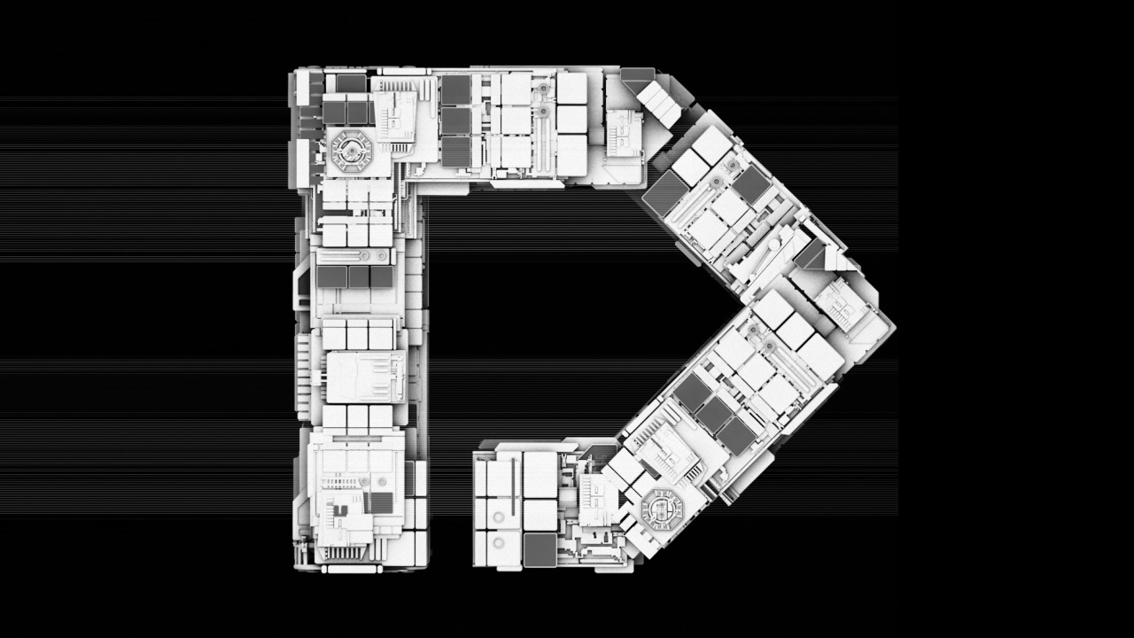
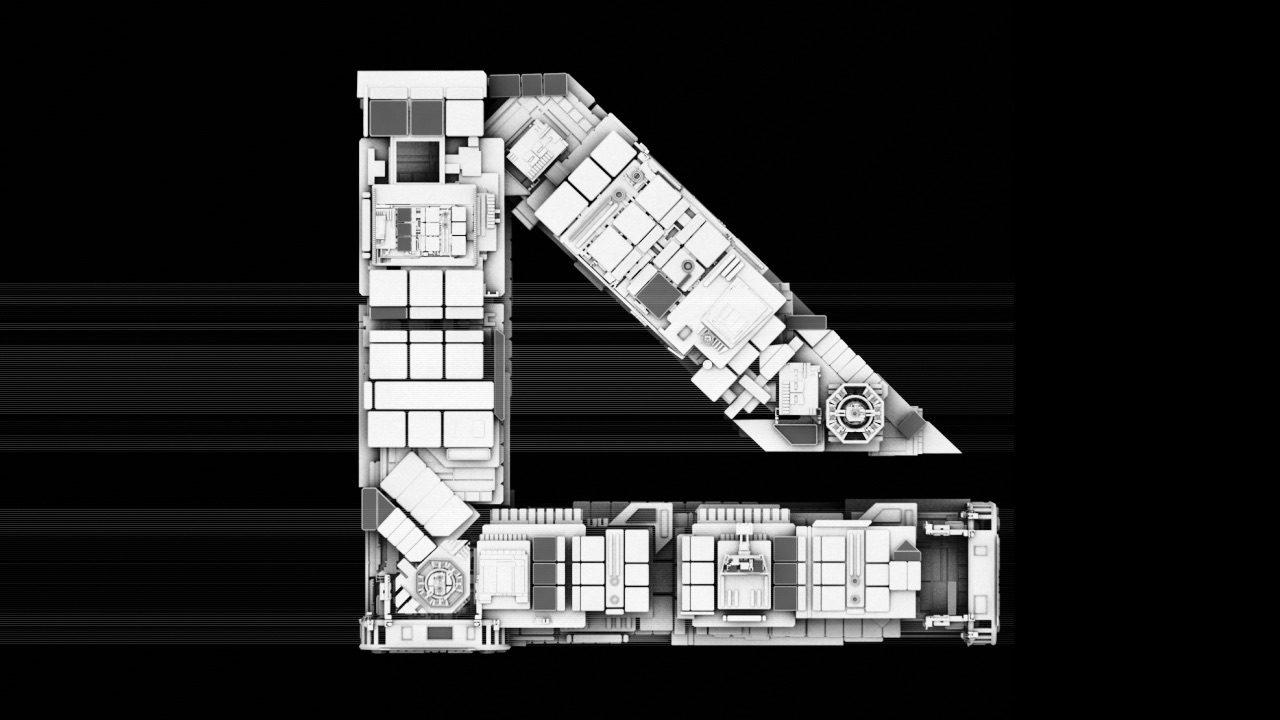
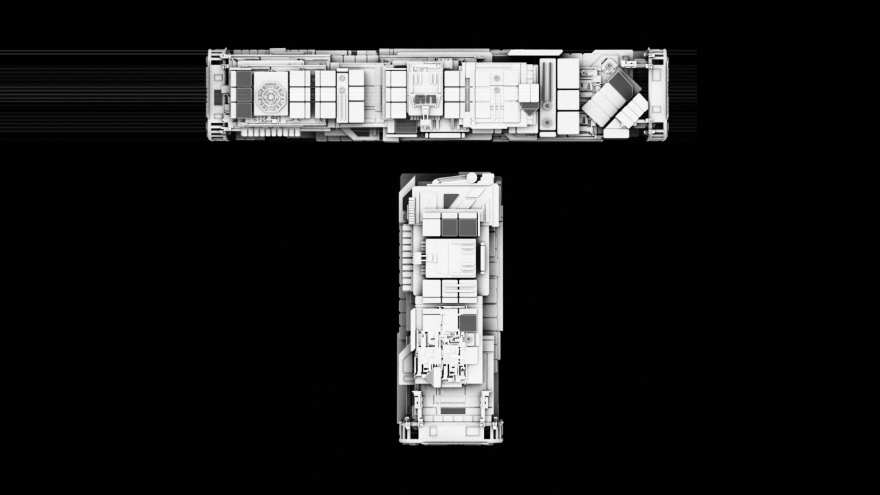
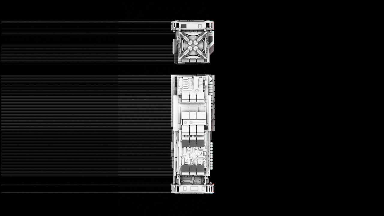
FOUNDATION began as an investigation into letters with volume, depth and physical behaviour. Each character was treated as a construction assembled from a shared geometric language.
The study moves from individual structures to a unified wordmark, then removes material and perspective until only the most recognisable graphic relationships remain.
The result is not a separate logo applied at the end. It is the final state of the same system: architecture compressed into a compact, iconic title mark.
Phase 01 · Constructed alphabet
Geometry becomes character.
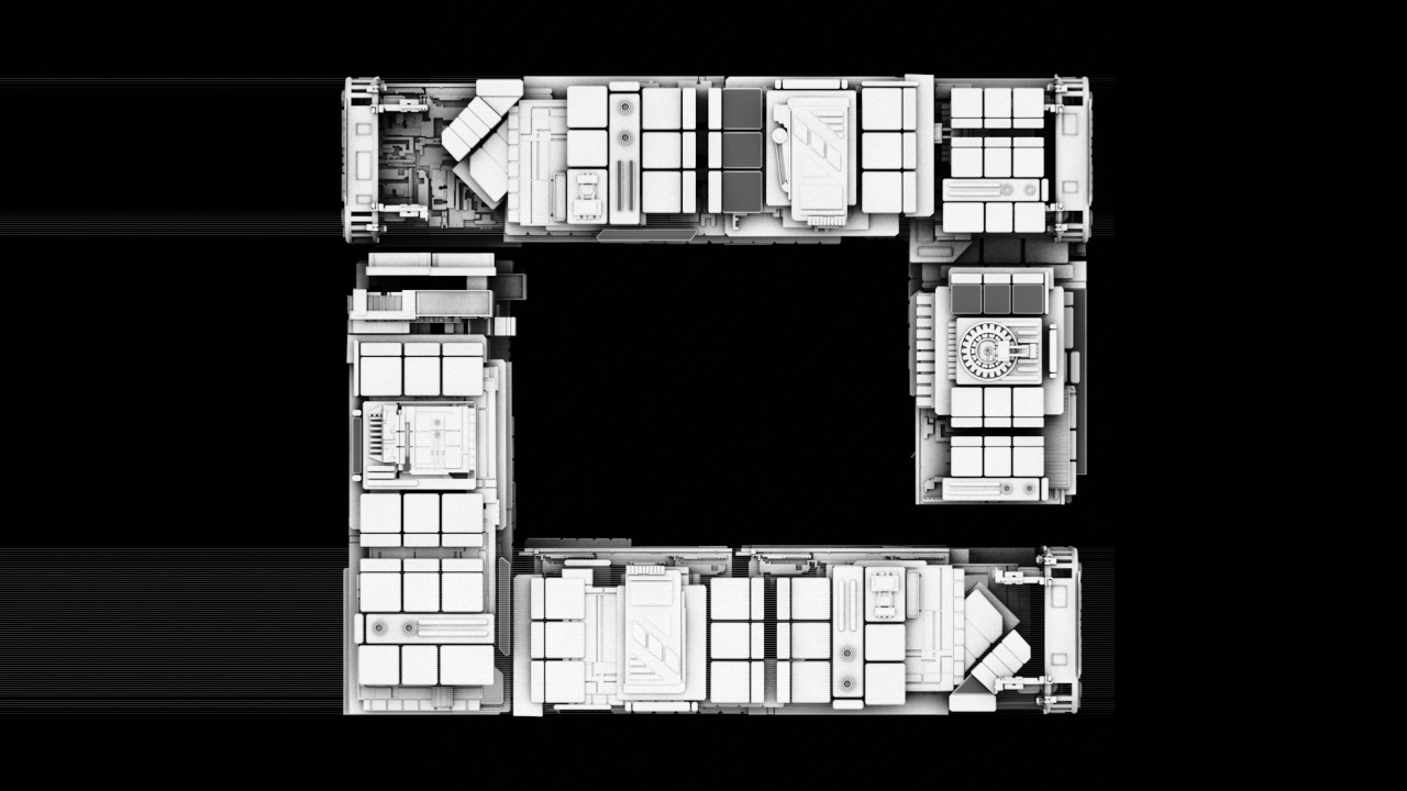
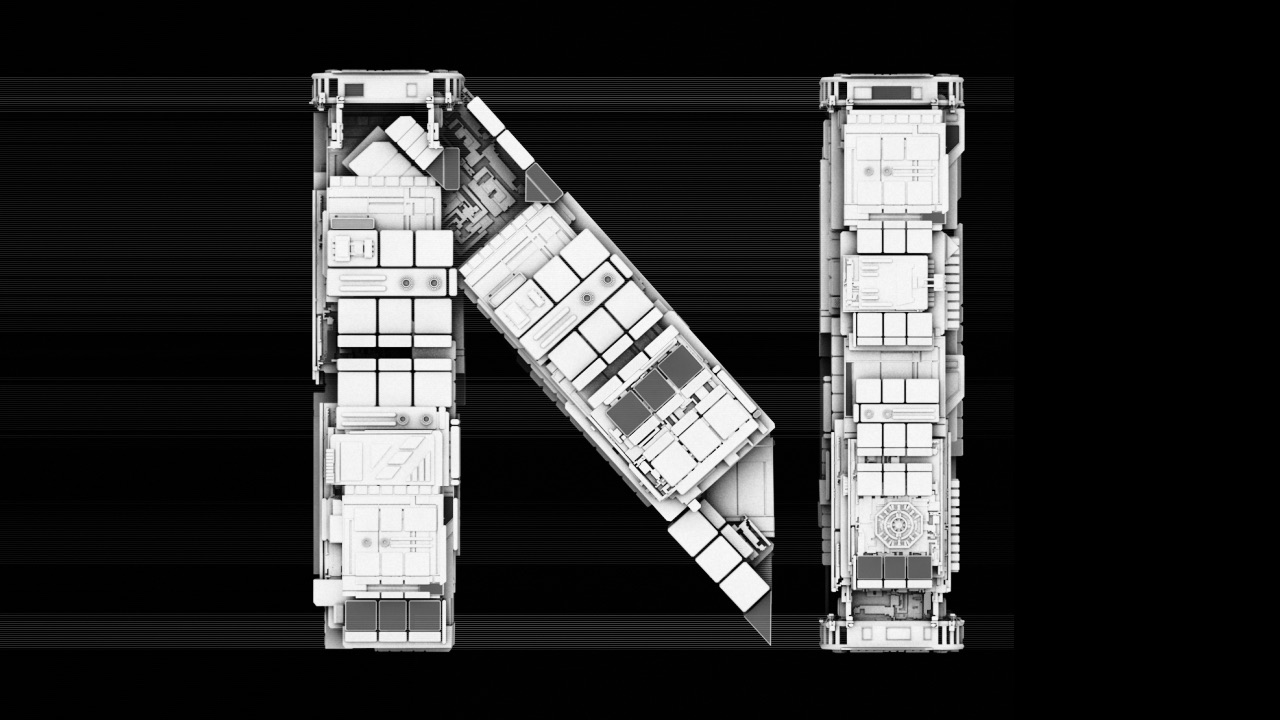
A small vocabulary of planes, apertures and suspended structures was tested across the letterforms.
The characters remain individual, but each is governed by the same spatial logic.
Phase 02 · Unified structure
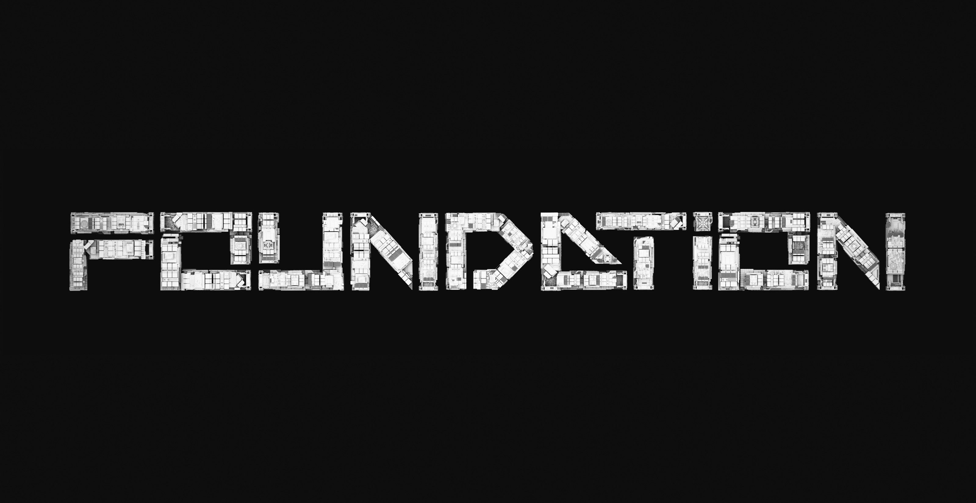
The alphabet becomes one object.
Once assembled, the letterforms operate less like type on a surface and more like a single engineered space.
Light, shadow and colour test how the system can shift in tone without losing its underlying construction.

Motion study
Modules switch, align and resolve.
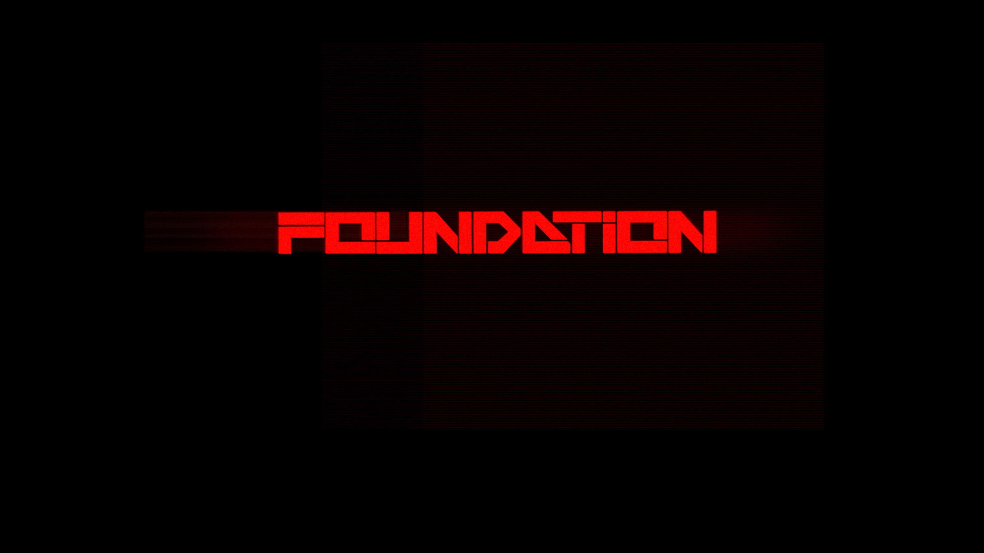
The title can animate through the same modular grammar: individual strokes and planes transition between abstract construction and readable wordmark.
Phase 03 · Reduction
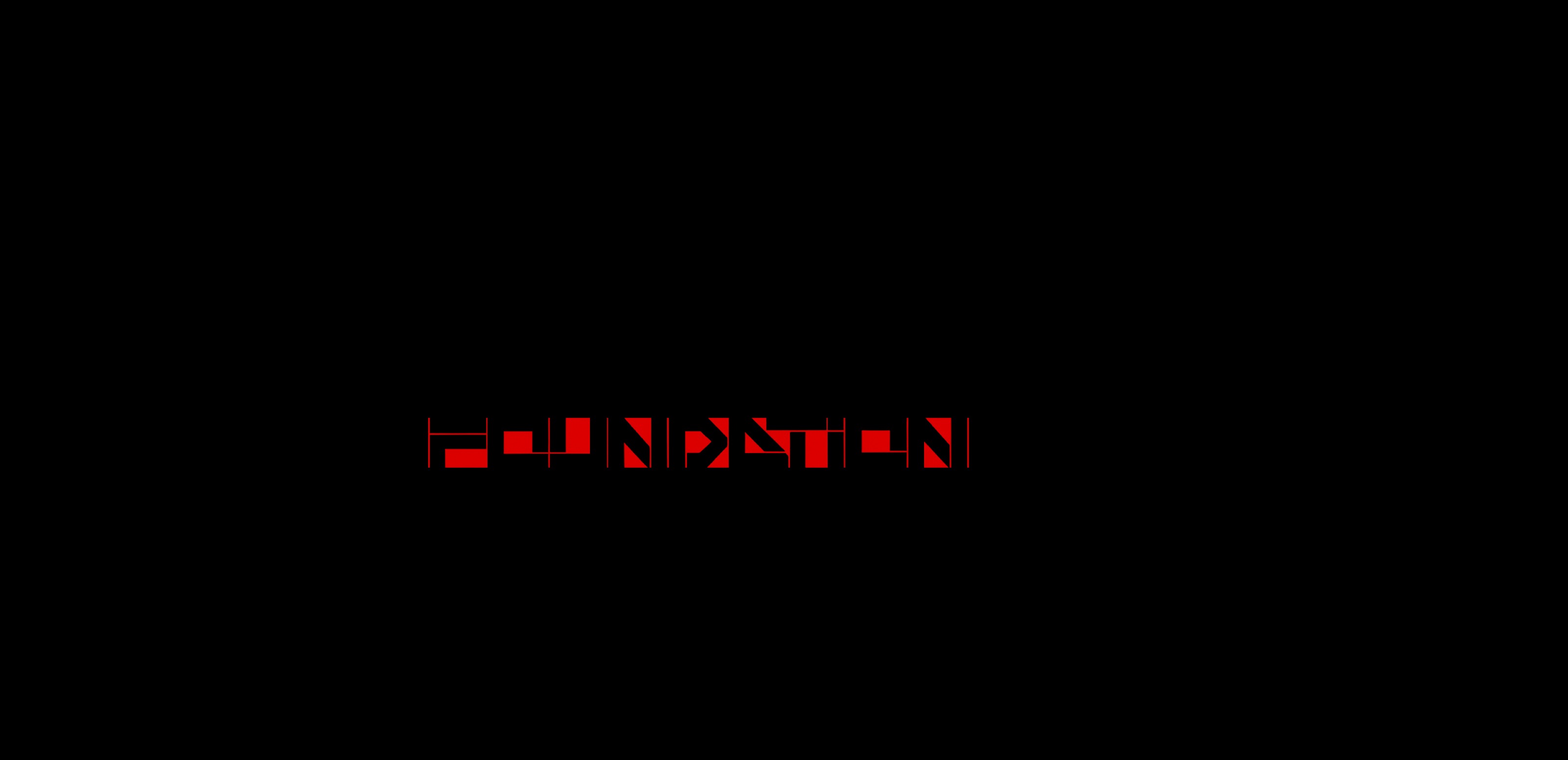
Depth collapses into identity.
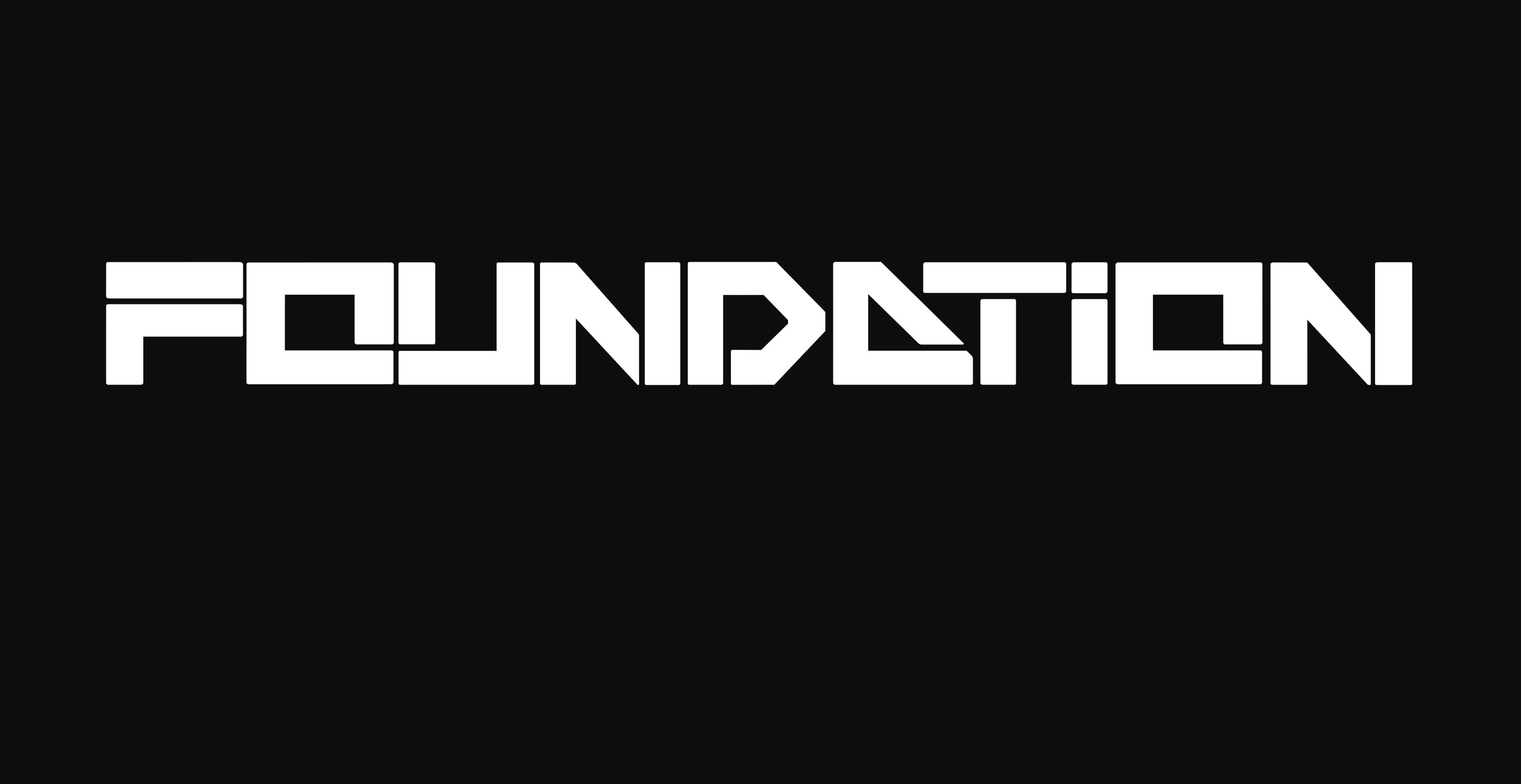
The final phase strips away the environmental treatment while retaining the proportions, intervals and directional energy of the 3D studies.
What remains is a compact mark that still carries the logic of the structure it came from.
Final state
One system, from structure to symbol.
Project credits
FOUNDATION
- Studio
- TCTS Studio
- Role
- Concept, design and 3D development
- Focus
- Spatial typography, title treatment and identity reduction