
Project 02 · Large-scale live experience
Expedia. Explore 26
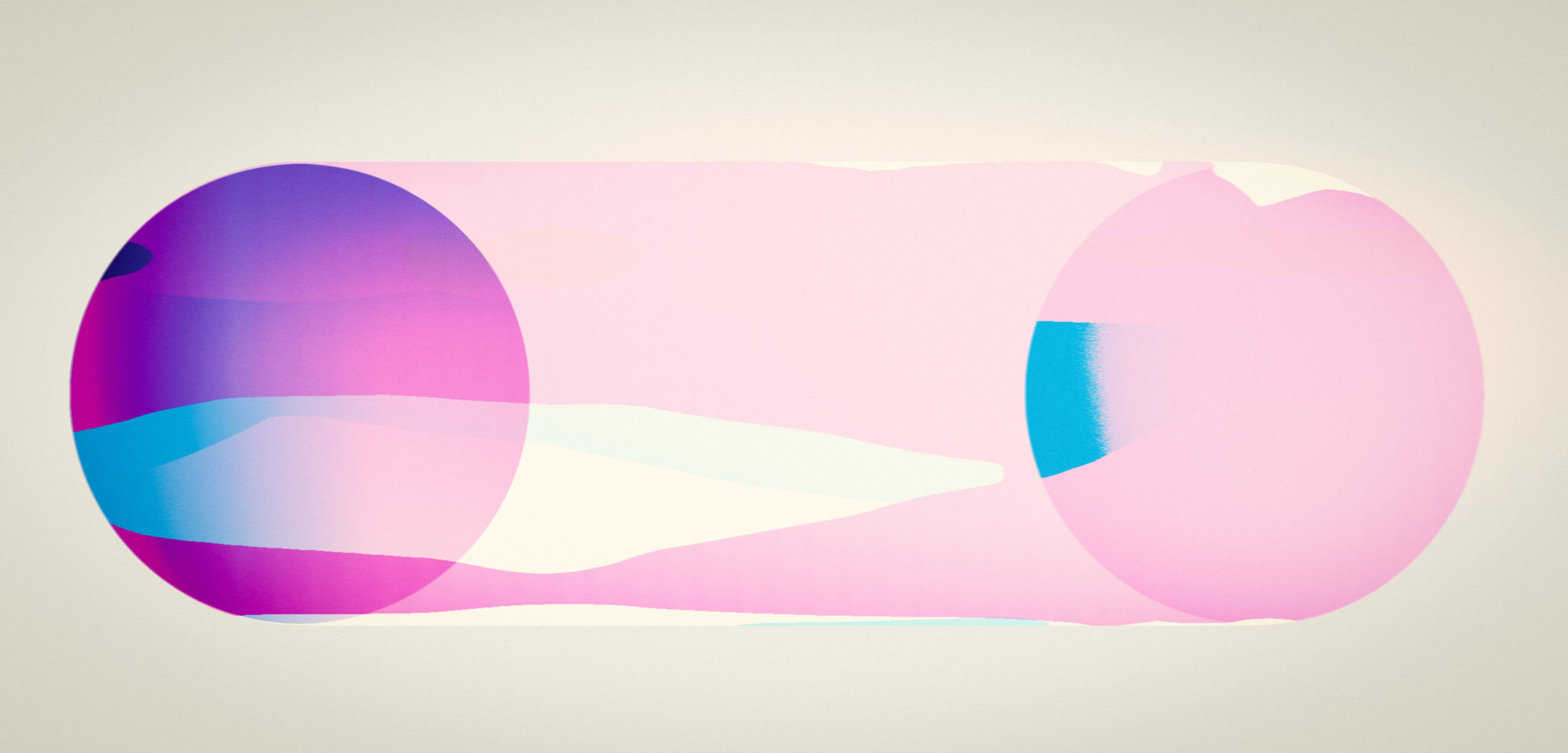
Travel as an emotional condition, not an image.
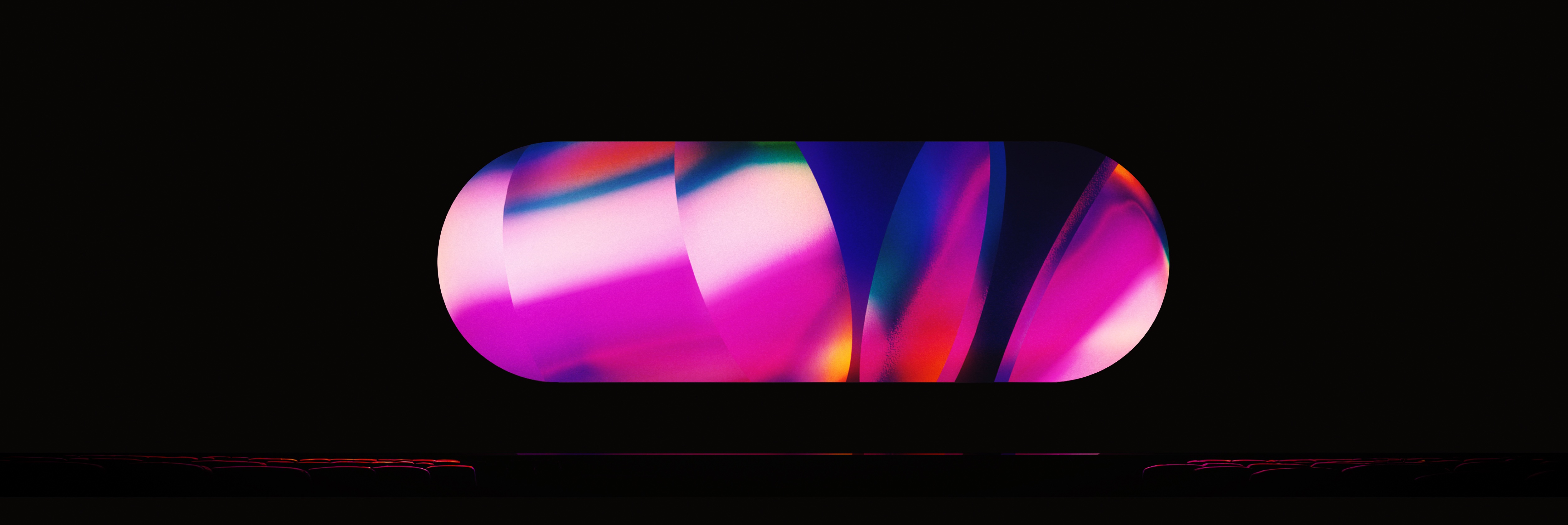
The project explored an abstract visual language for a custom lozenge-shaped display environment.
Rather than relying on literal travel imagery, the work investigated how colour, atmosphere, movement and geometry could communicate the emotional experience of travel within the constraints of the format.
The process focused on building a flexible system capable of expressing anticipation, transition and arrival while remaining adaptable across a large-scale live environment.
The screen itself became the organising principle: a fixed architecture through which changing states of colour, depth and light could unfold.
Phase 01 · Core language exploration
A system shaped by its frame.
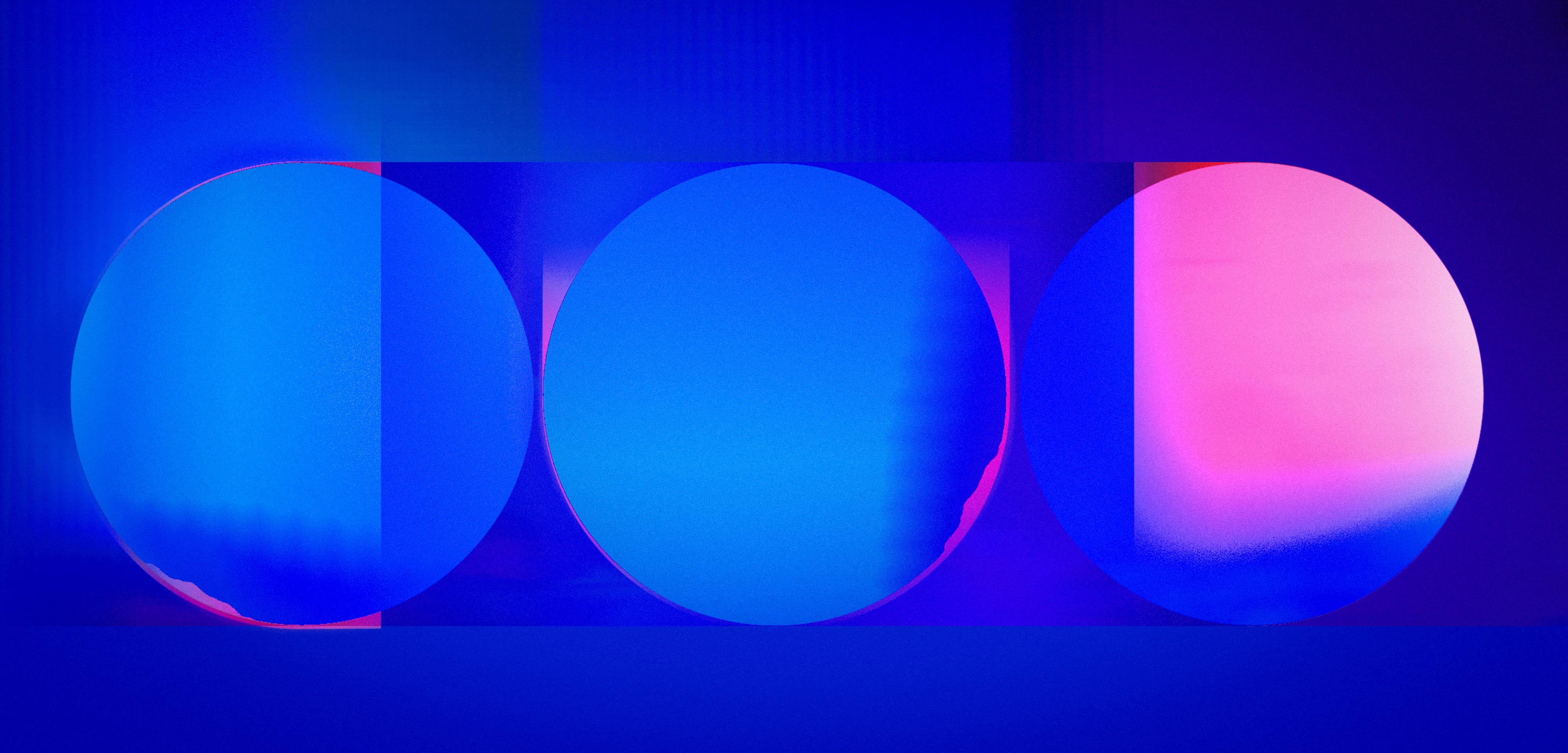
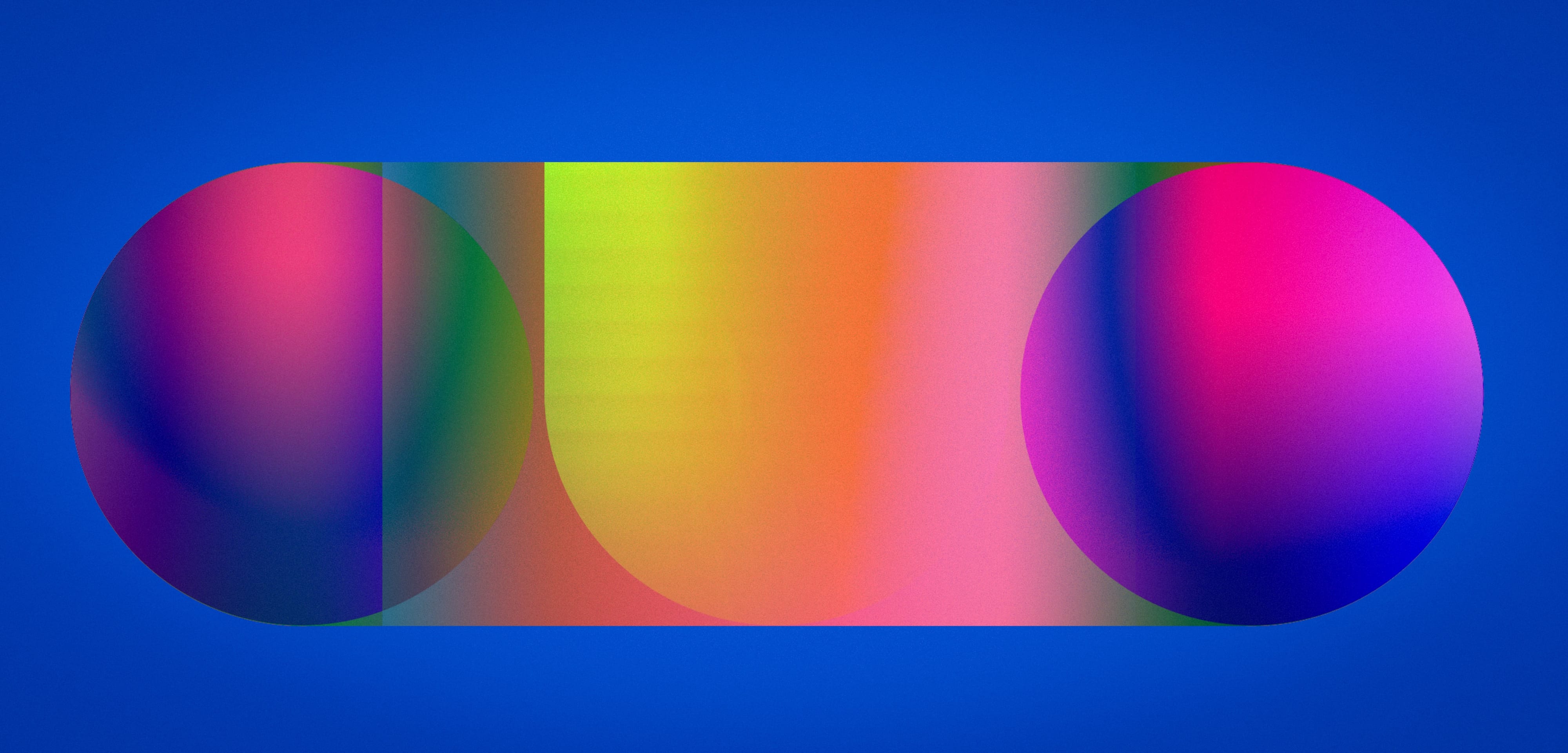
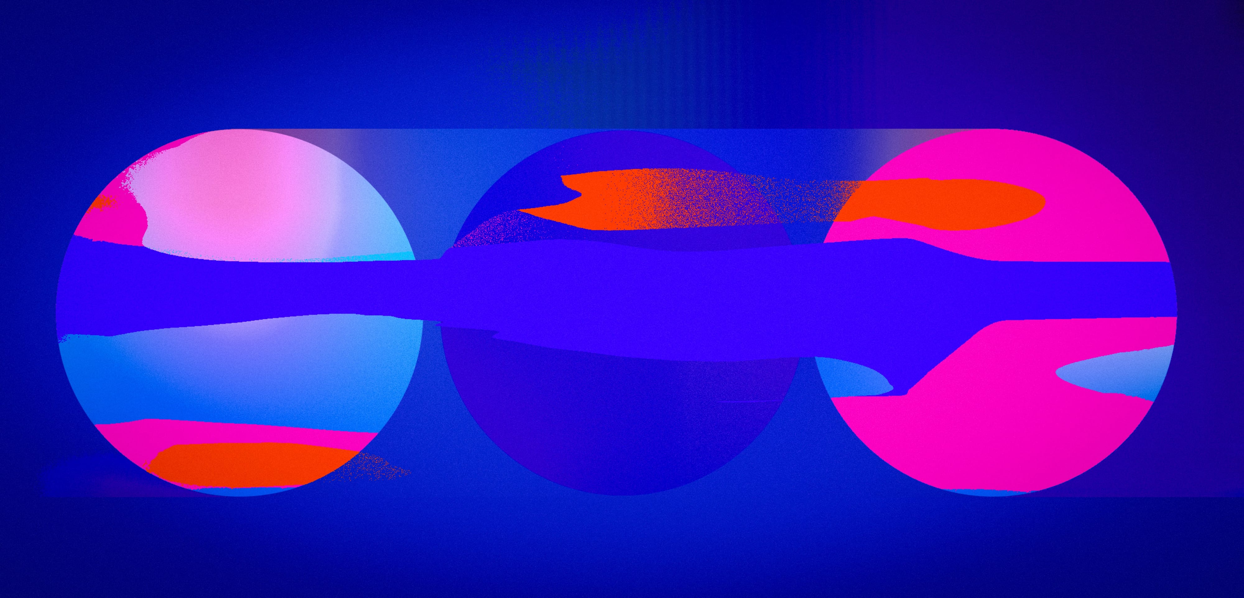
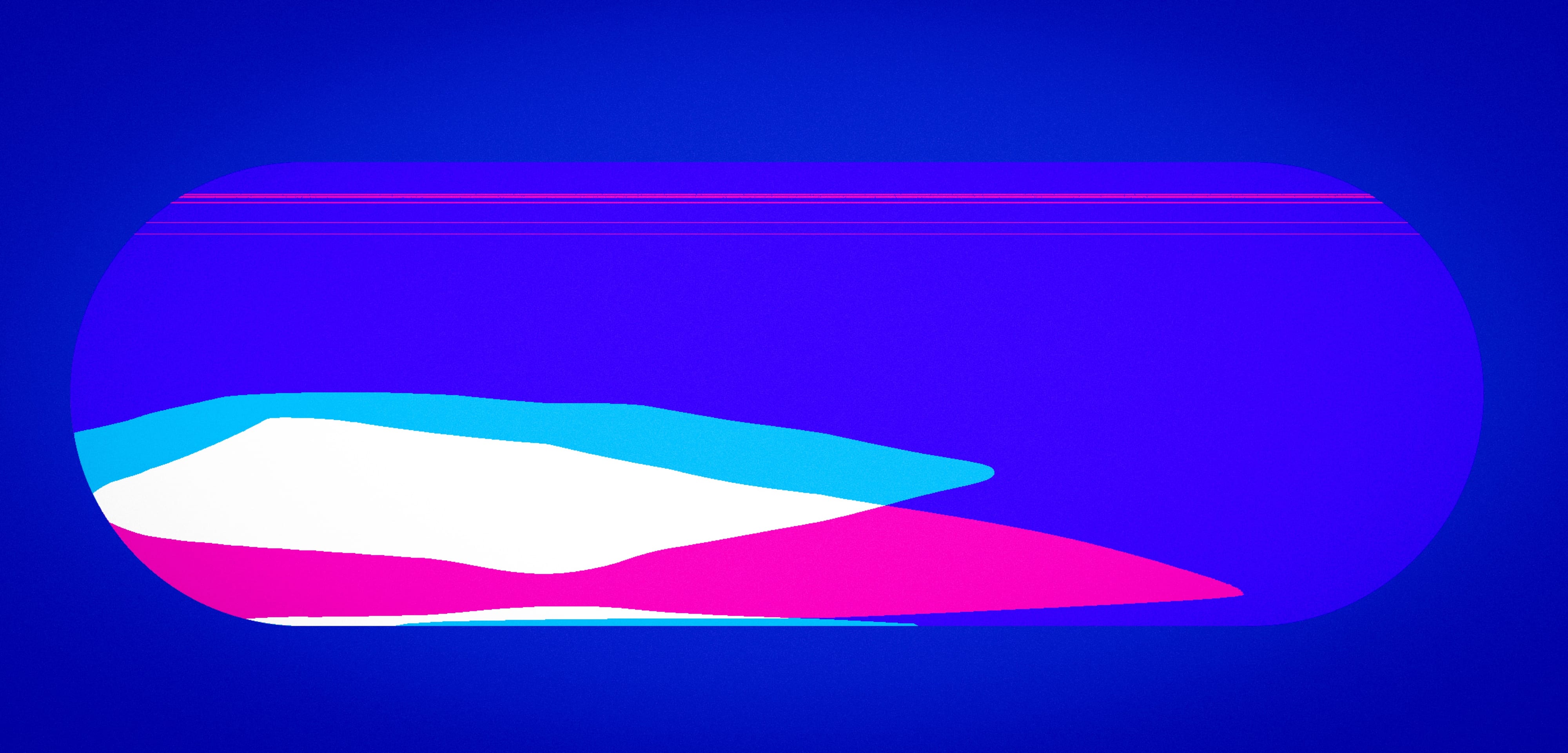
The initial phase treated the lozenge-shaped screen as both a constraint and an opportunity. The aim was to develop a visual language with clarity, flexibility and emotional resonance.
Transparency, colour interaction, spatial layering and graphic rhythm were tested as the primary components of a system that could change in character without losing coherence.
Phase 02 · Atmospheric distillation
Less information. More feeling.
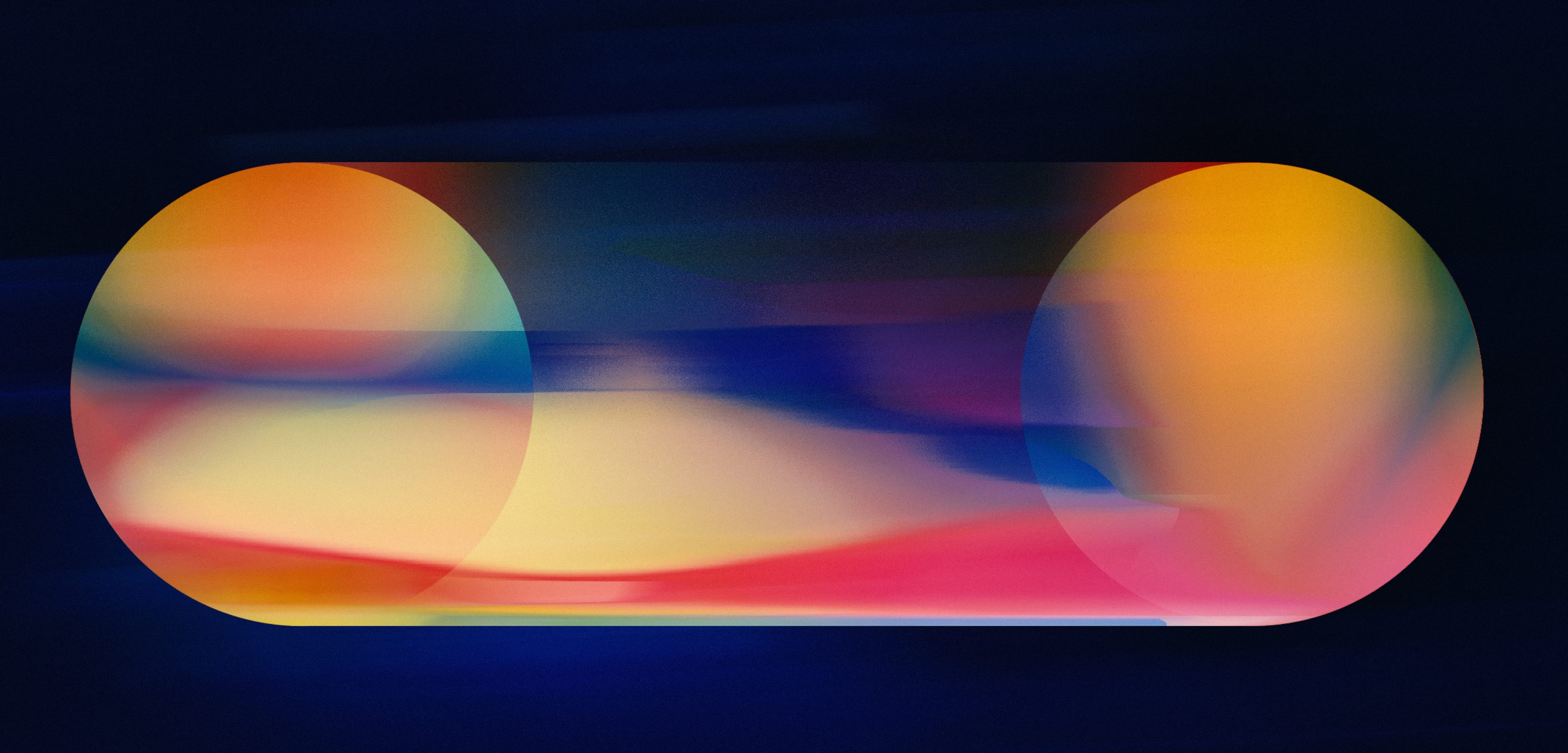
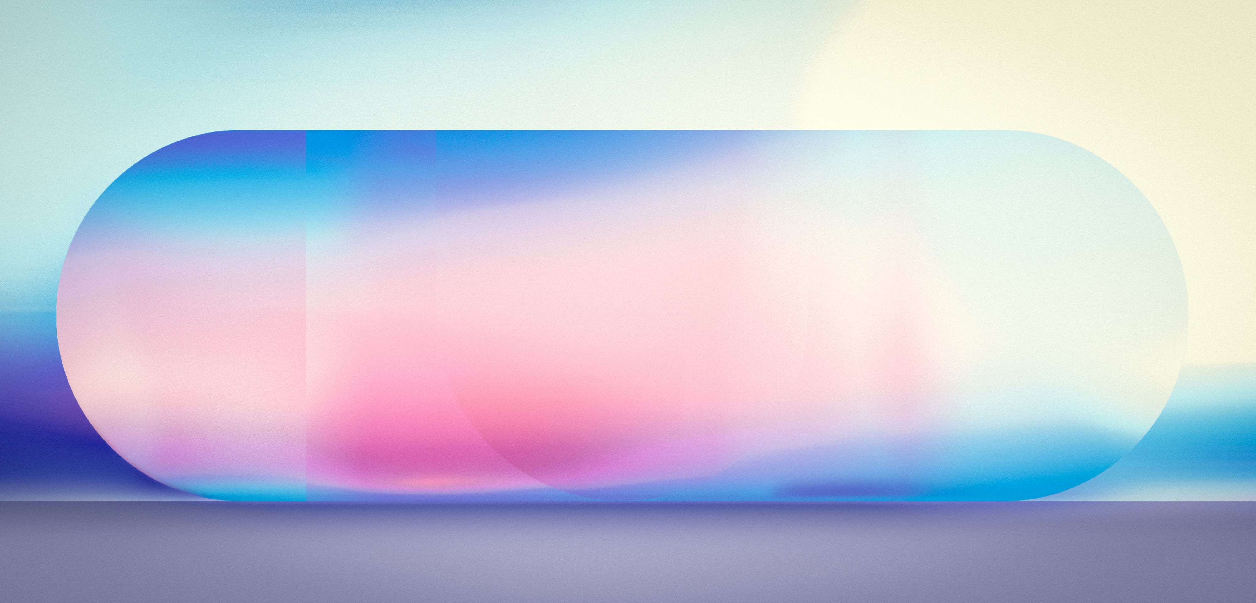
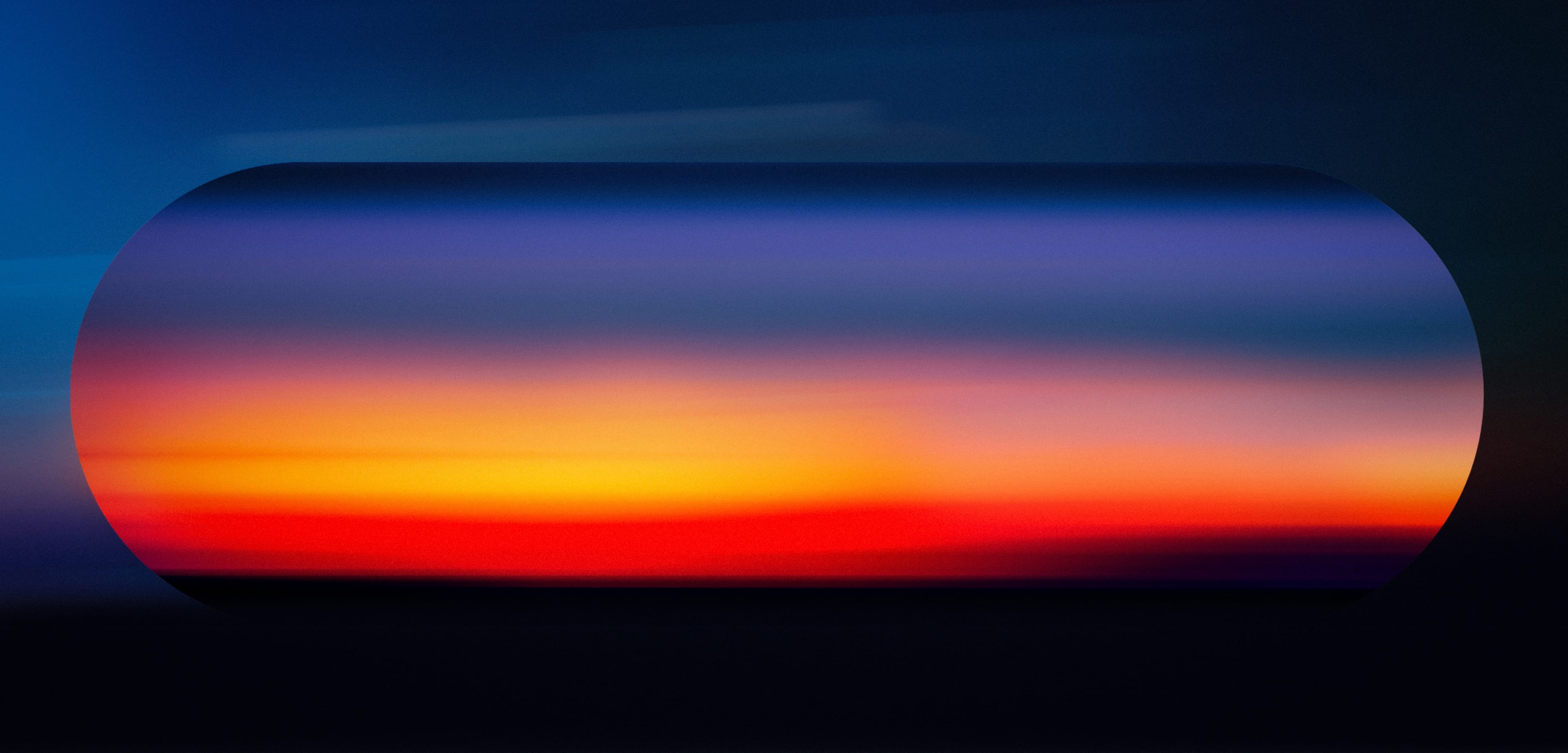
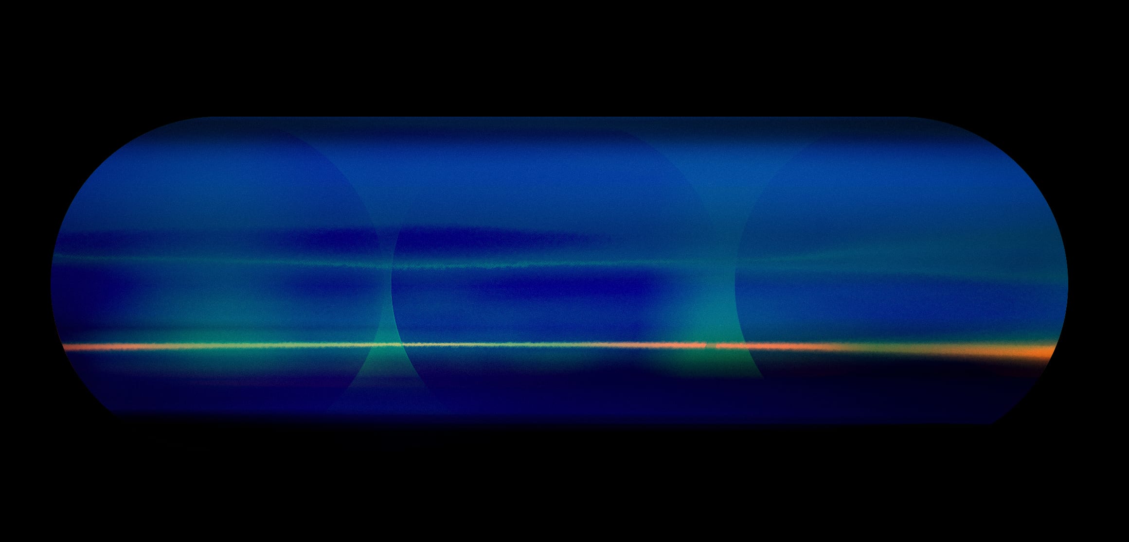
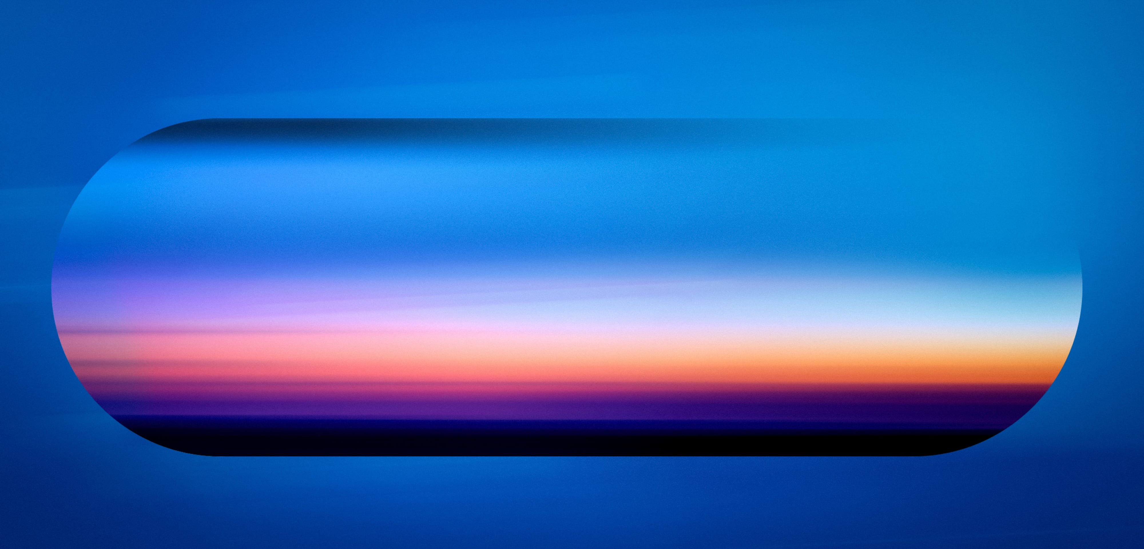
The second phase reduced the earlier graphic language. Colour, light and transparency became the primary carriers of meaning.
By stripping away information while retaining motion, depth and emotional resonance, the display began to behave less like a screen and more like an atmospheric presence.
Phase 03 · Material and optical systems
Depth without added complexity.
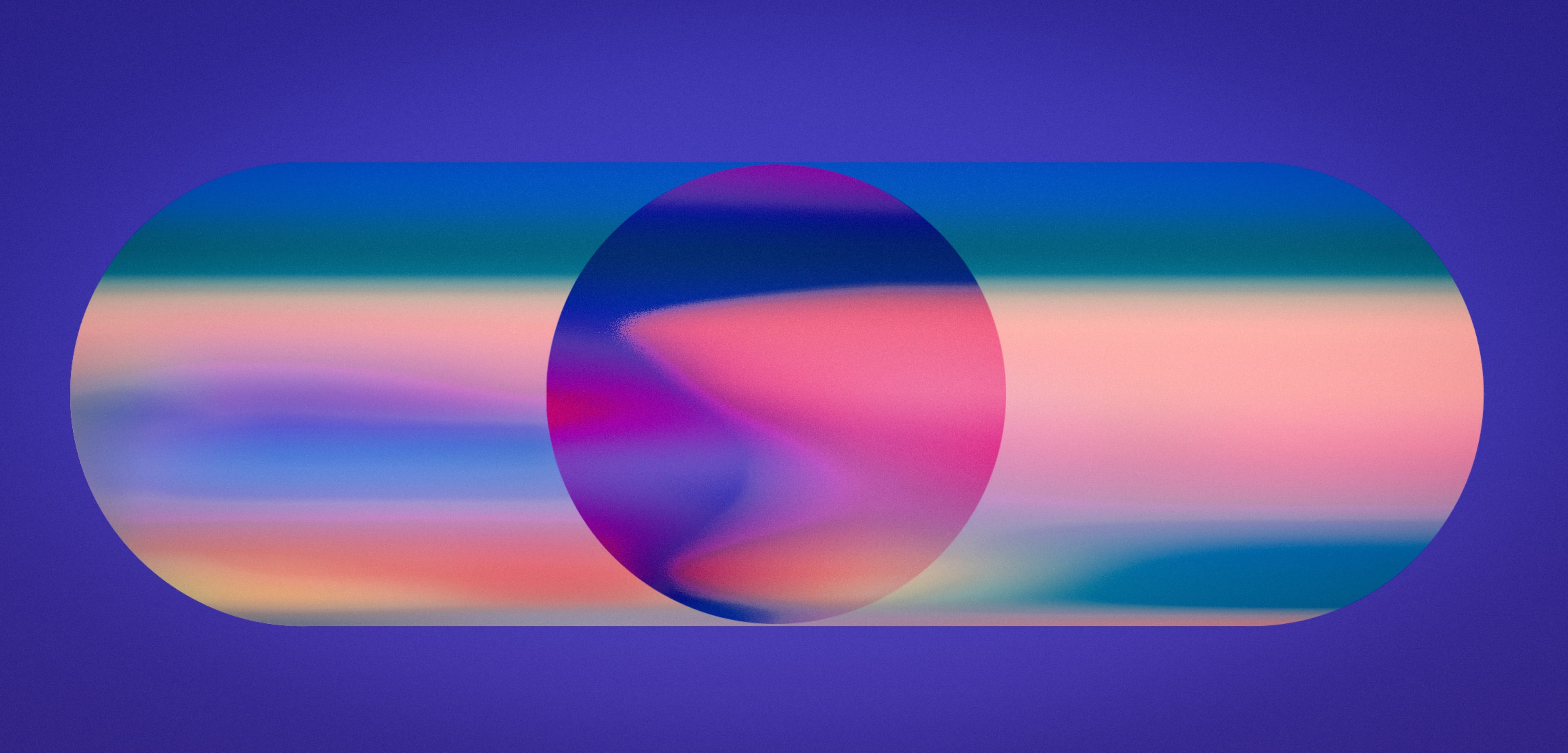
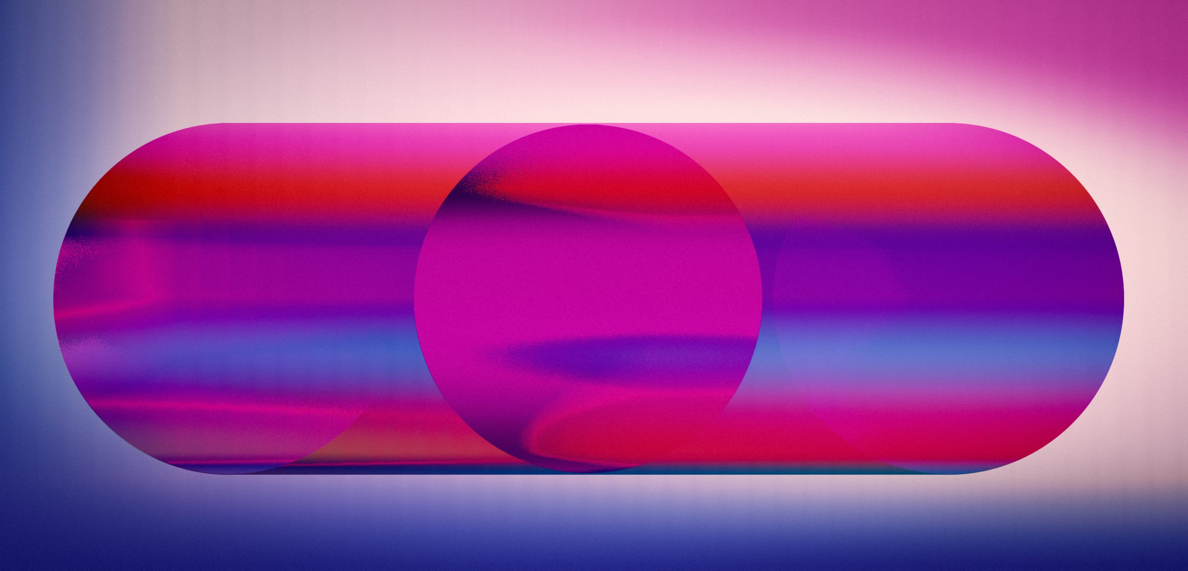
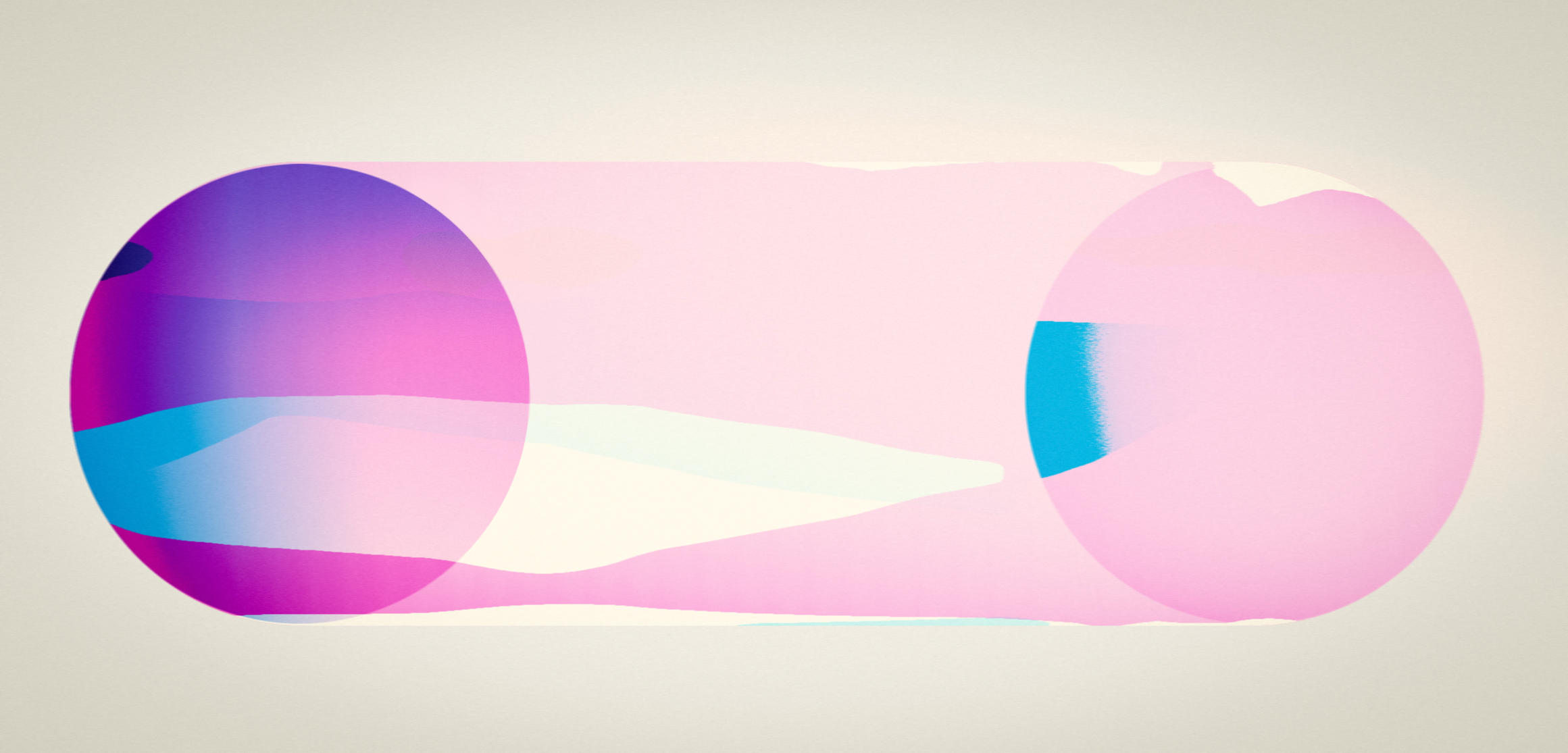
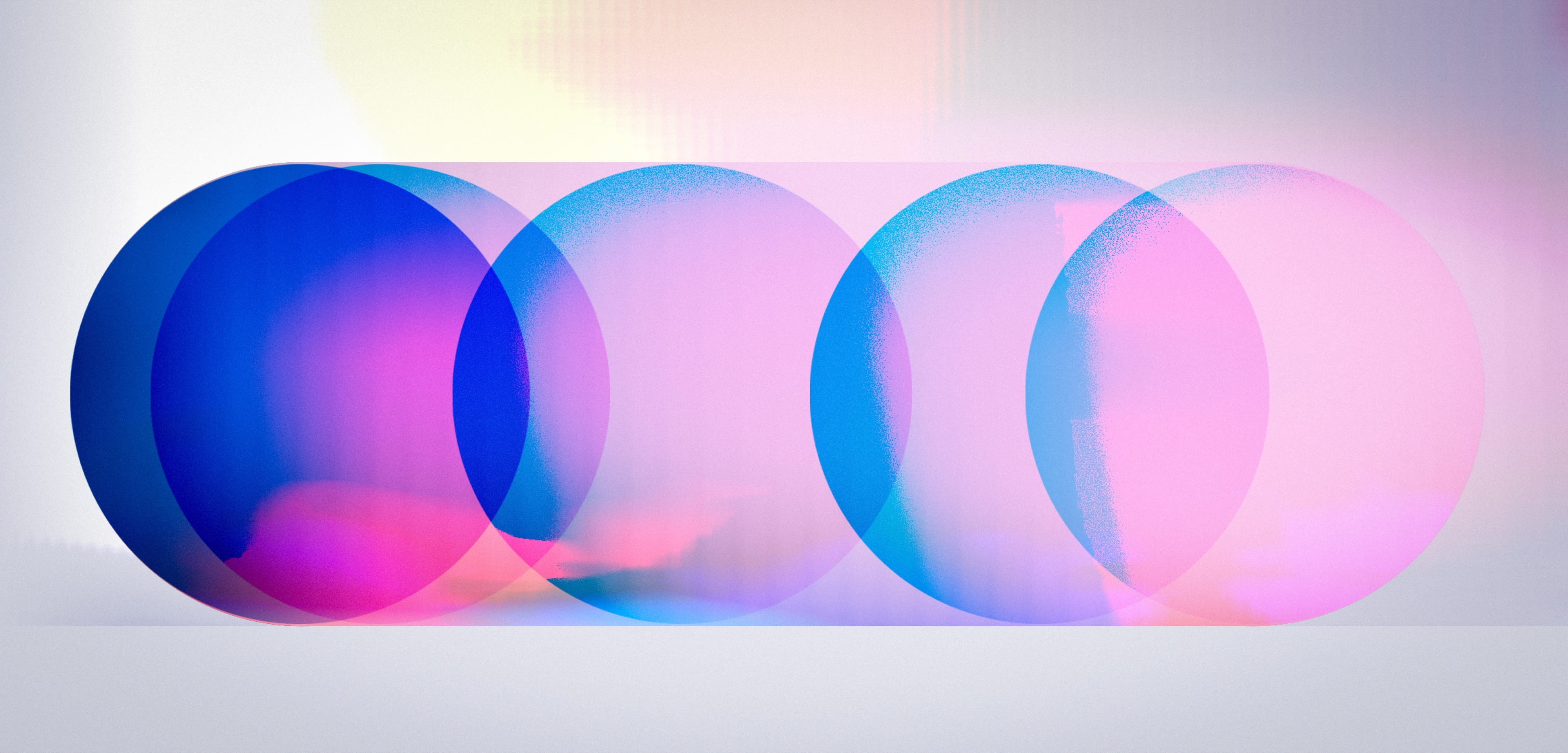
The language was then tested through material and optical behaviour. Transparency, overlap and refraction created movement and richness while preserving the simplicity of the underlying system.
These studies shifted the work from flat graphic composition towards a more spatial, tactile and responsive visual field.
Phase 04 · Scenario testing
Behaviour at environmental scale.
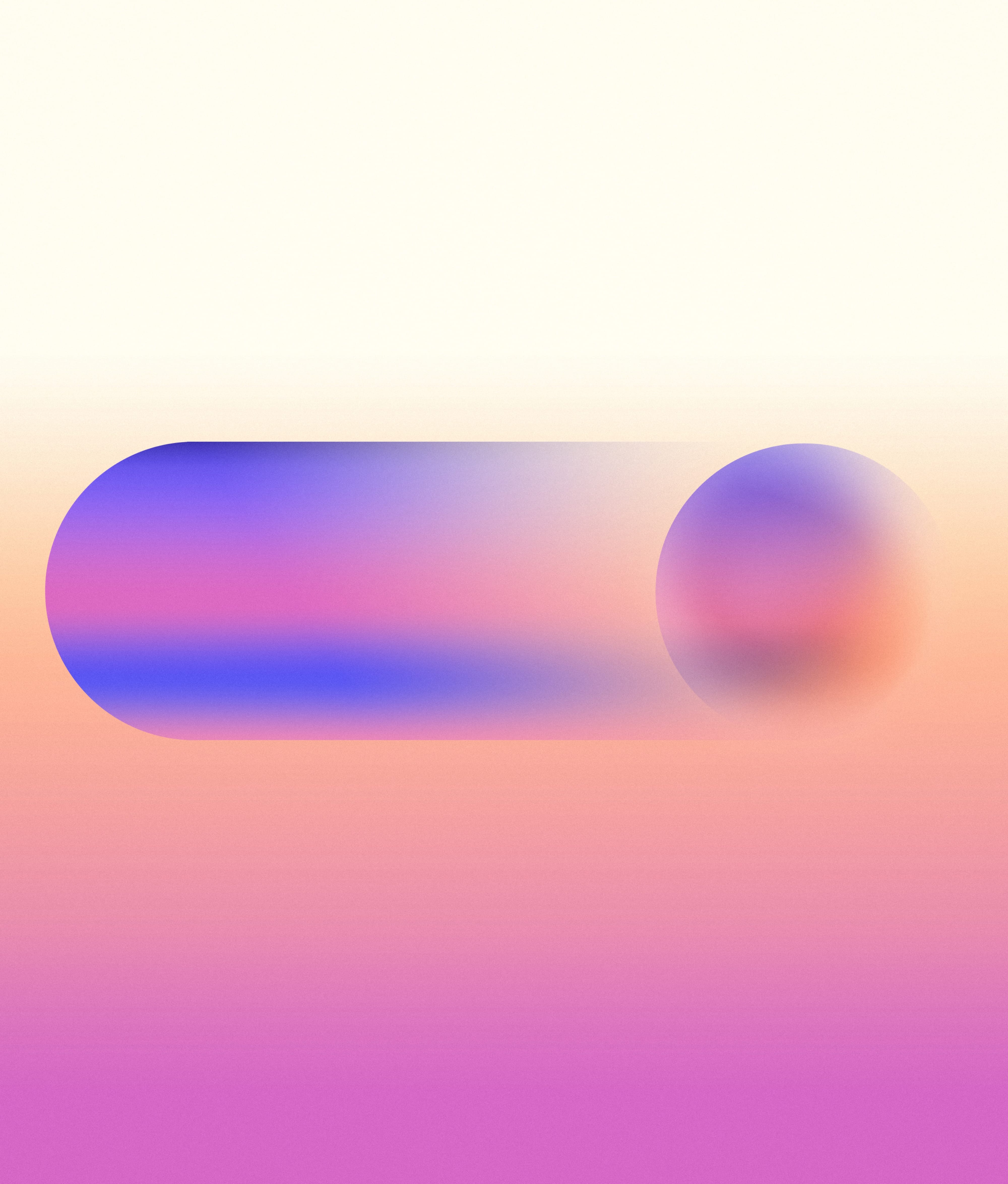
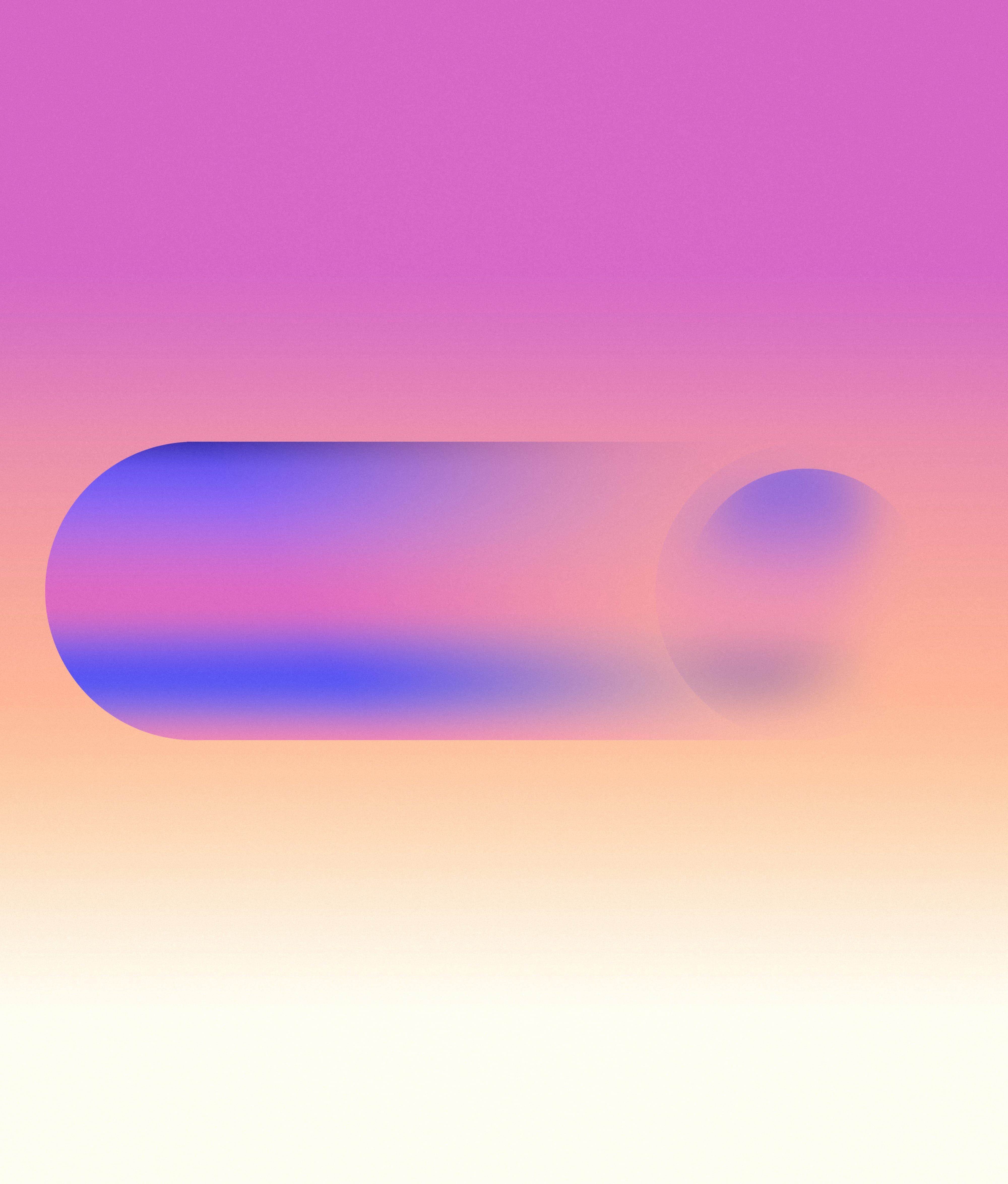
The system was tested against changing environmental conditions to determine which visual behaviours remained legible and emotionally effective at scale.
The studies examined how the lozenge could sit within light, colour and surrounding space without becoming a conventional piece of screen content.
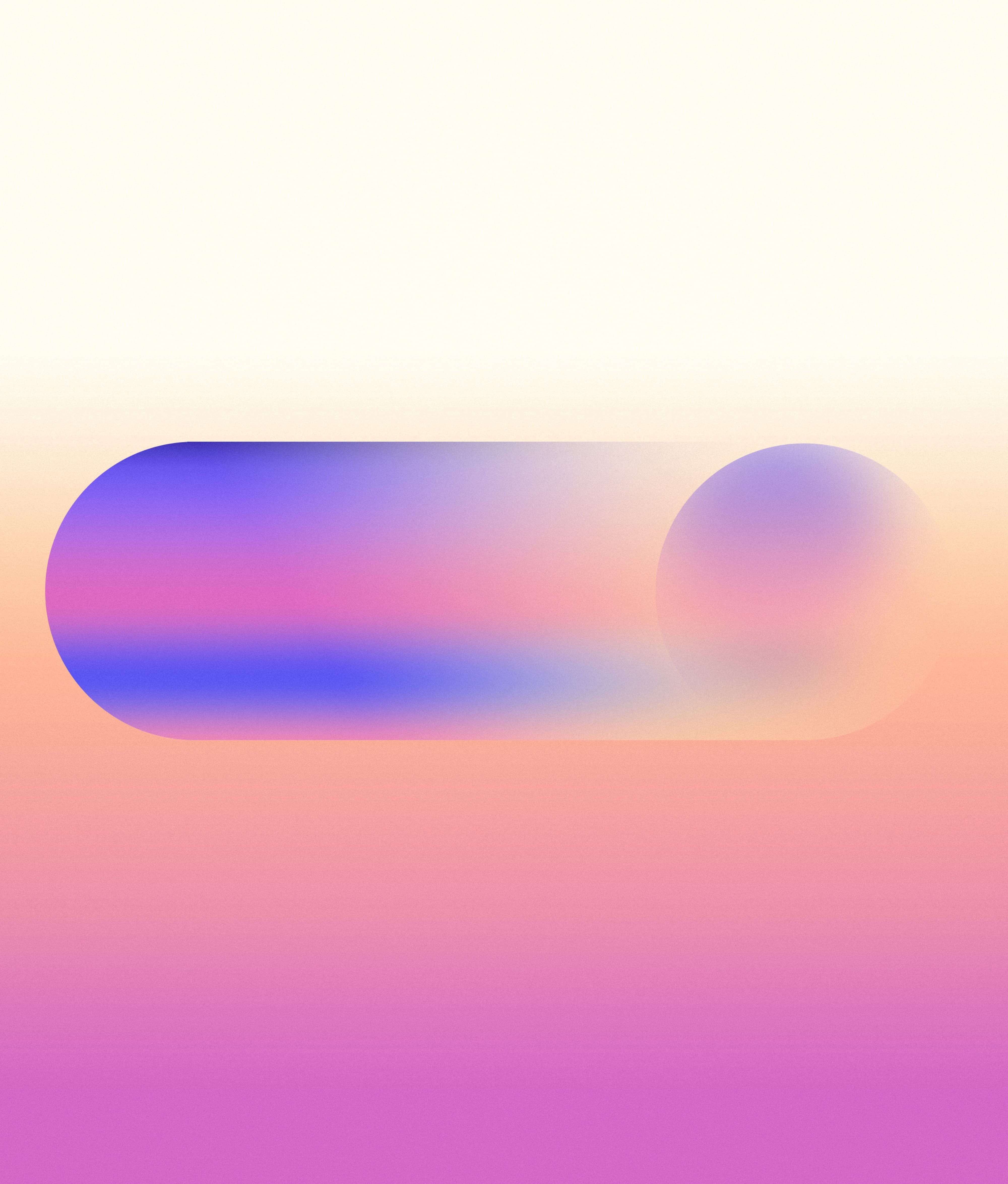
Final direction
Atmosphere, materiality and graphic clarity.
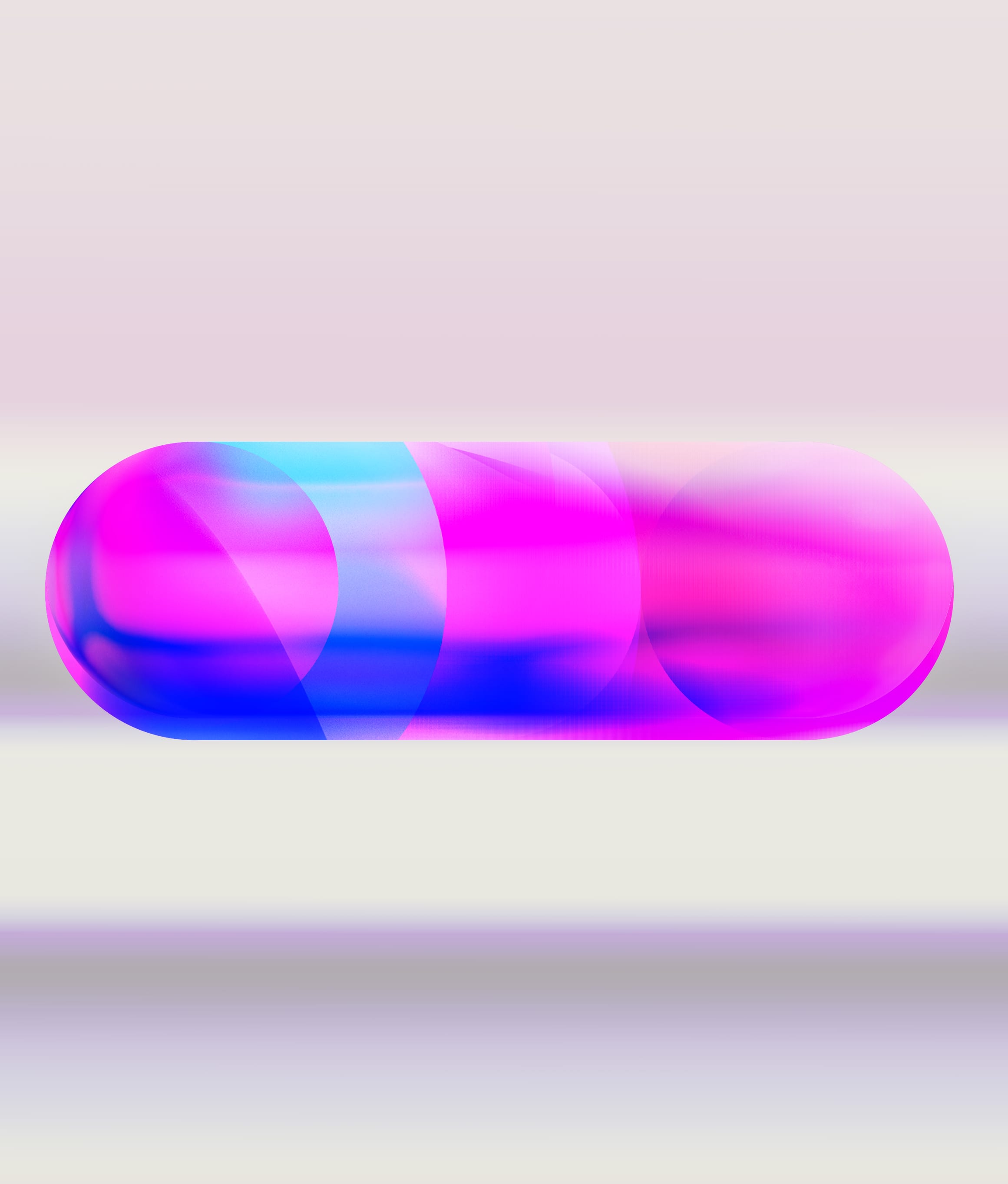
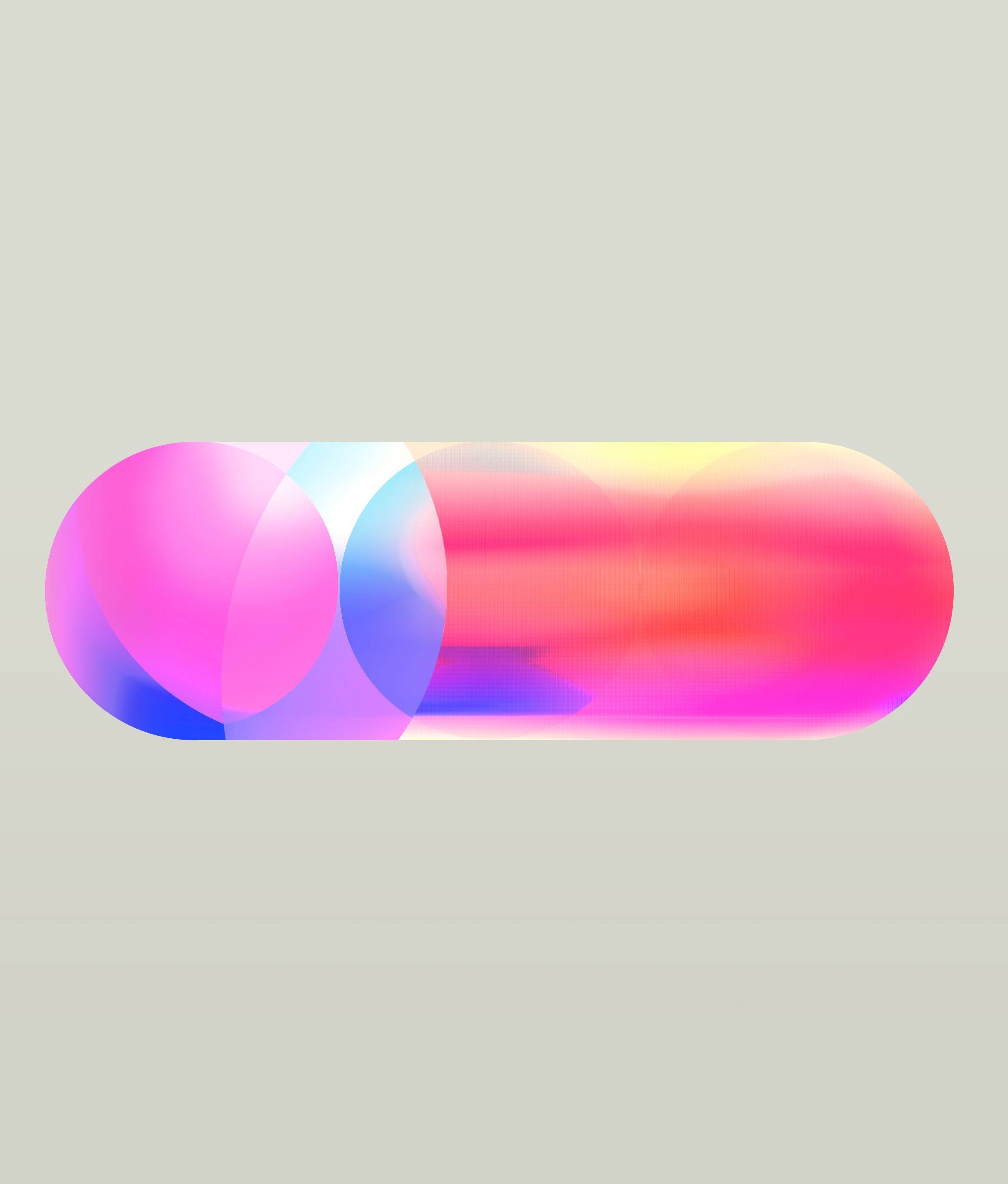
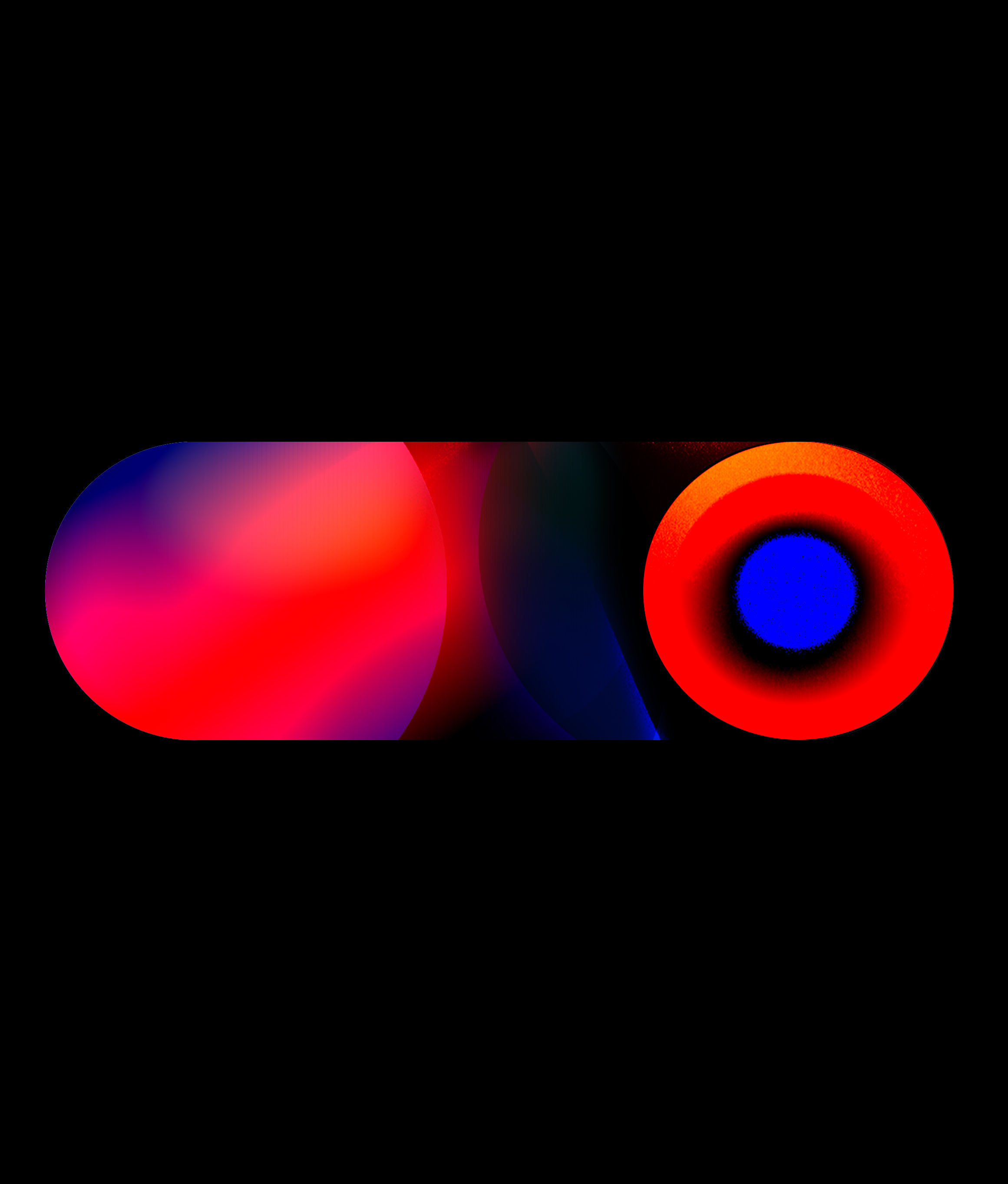
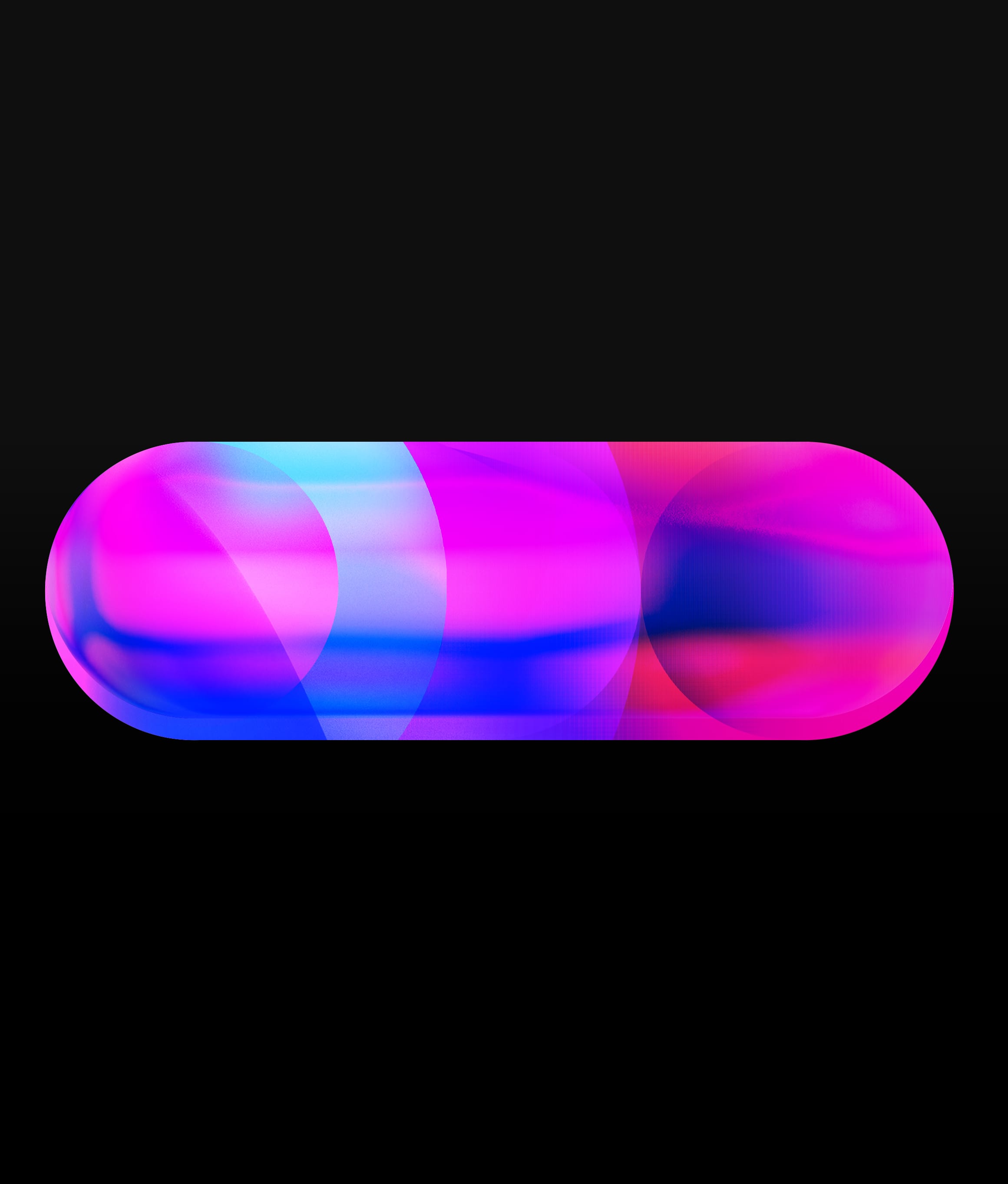
The final direction brought together the strongest qualities from each phase: a clear structural identity, atmospheric colour and a material sense of depth.
The lozenge remained fixed while its internal behaviour could shift between calm, luminous and high-energy states—forming one adaptable visual language for the wider experience.
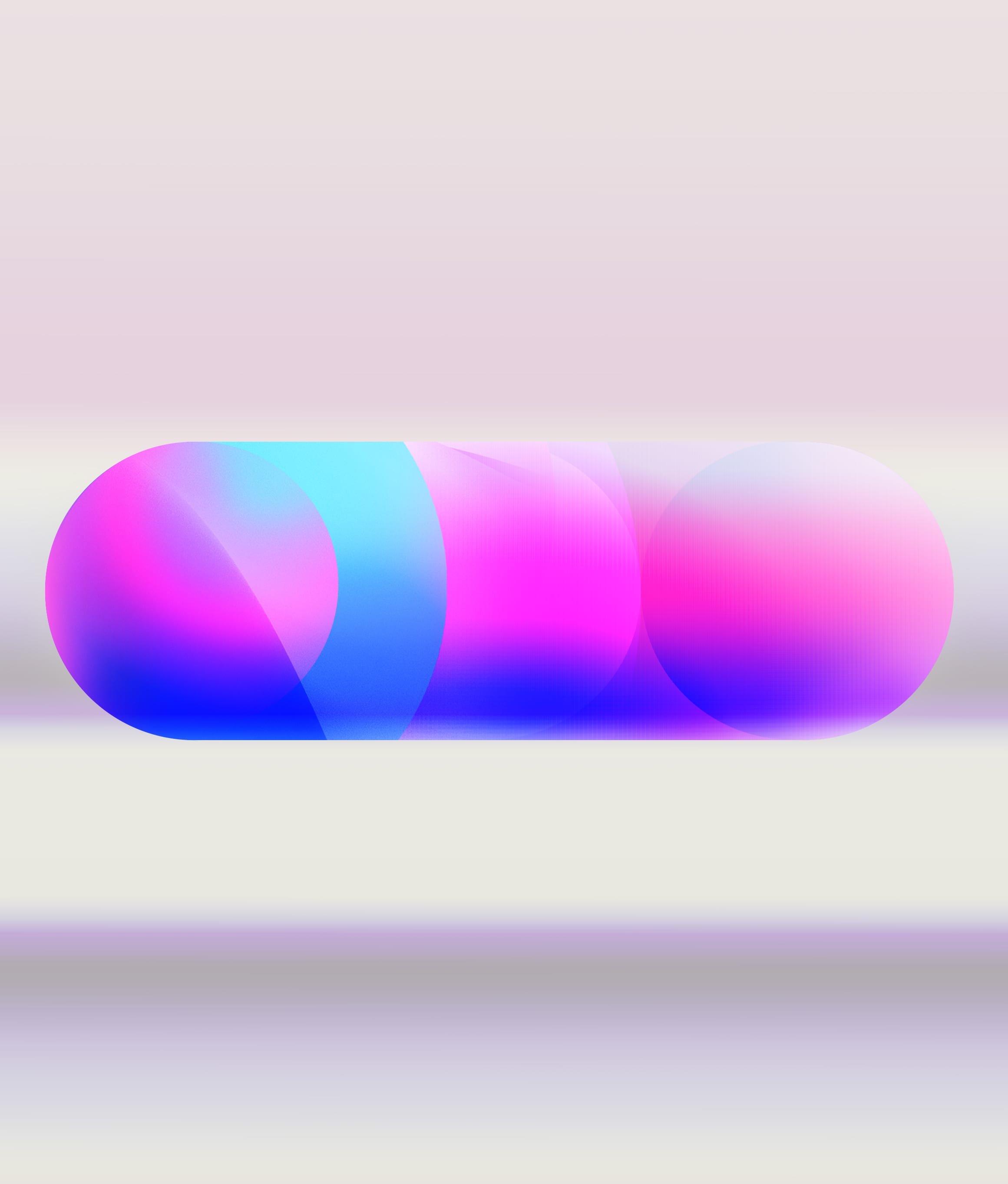
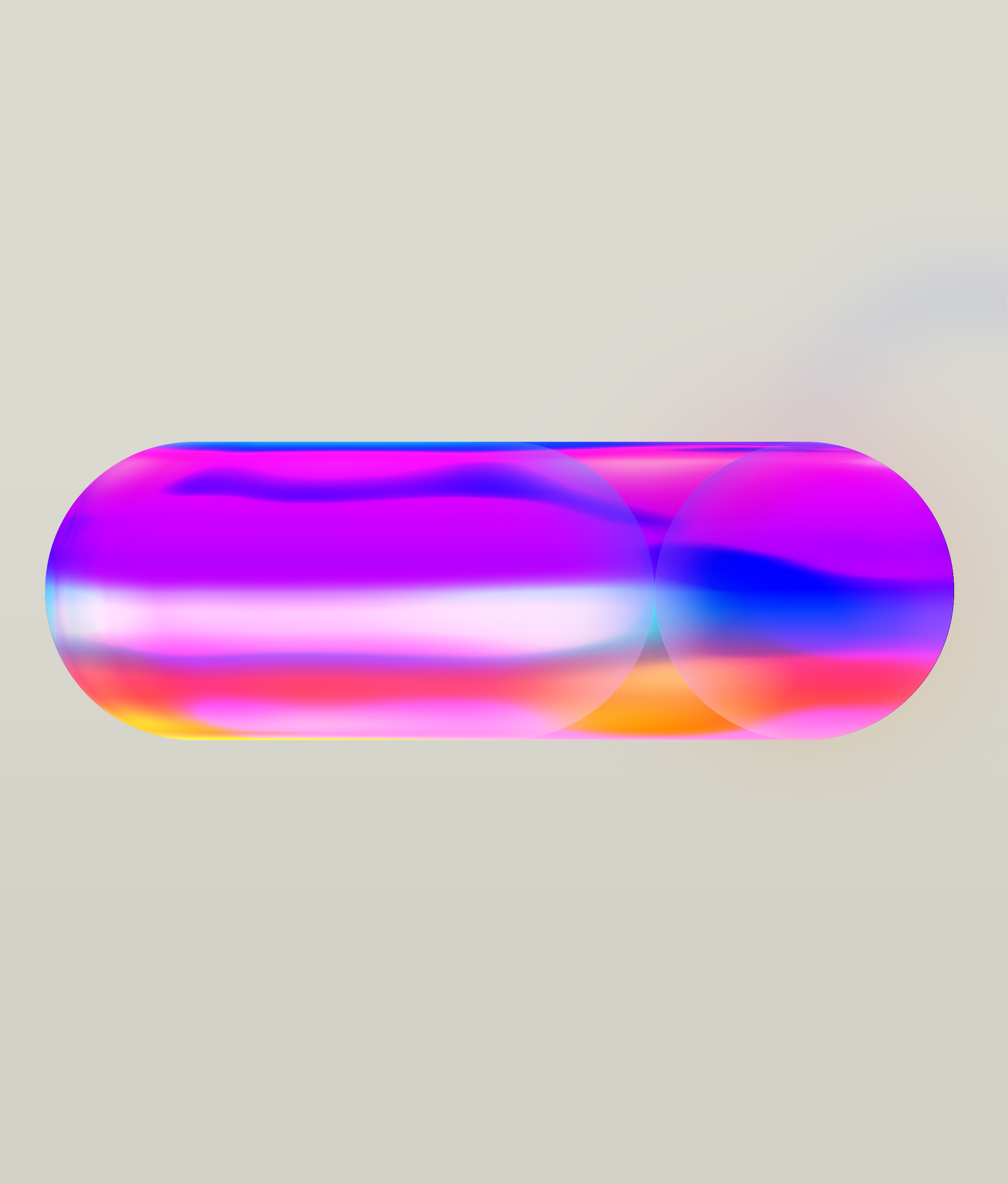
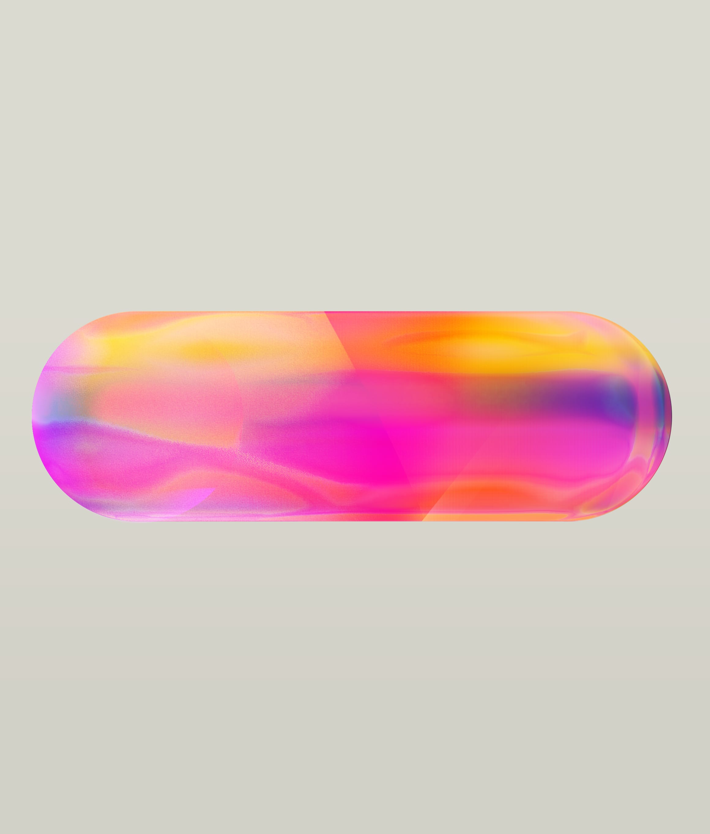
Result
A framework for emotional movement.
The visual system became a defining creative component of the proposed live environment.
It evolved from graphic structure into a richer material and atmospheric system, using transparency, colour interaction, optical layering and scale to create a unified language for anticipation, transition and arrival.
The final direction was not implemented as intended due to production budget constraints. The development nevertheless established a clear visual framework and a resolved creative direction for the experience.
Project credits
Explore 26
- Client
- Expedia
- Studio
- Nathan Prince Studio
- Role
- Conceptual Direction & Visual Development