Precision and balance
Balanced compositions, restrained use of space and controlled geometric relationships create a sense of quiet authority, expressing technical precision through clarity, proportion and restraint.

Project 01 · Ambient film
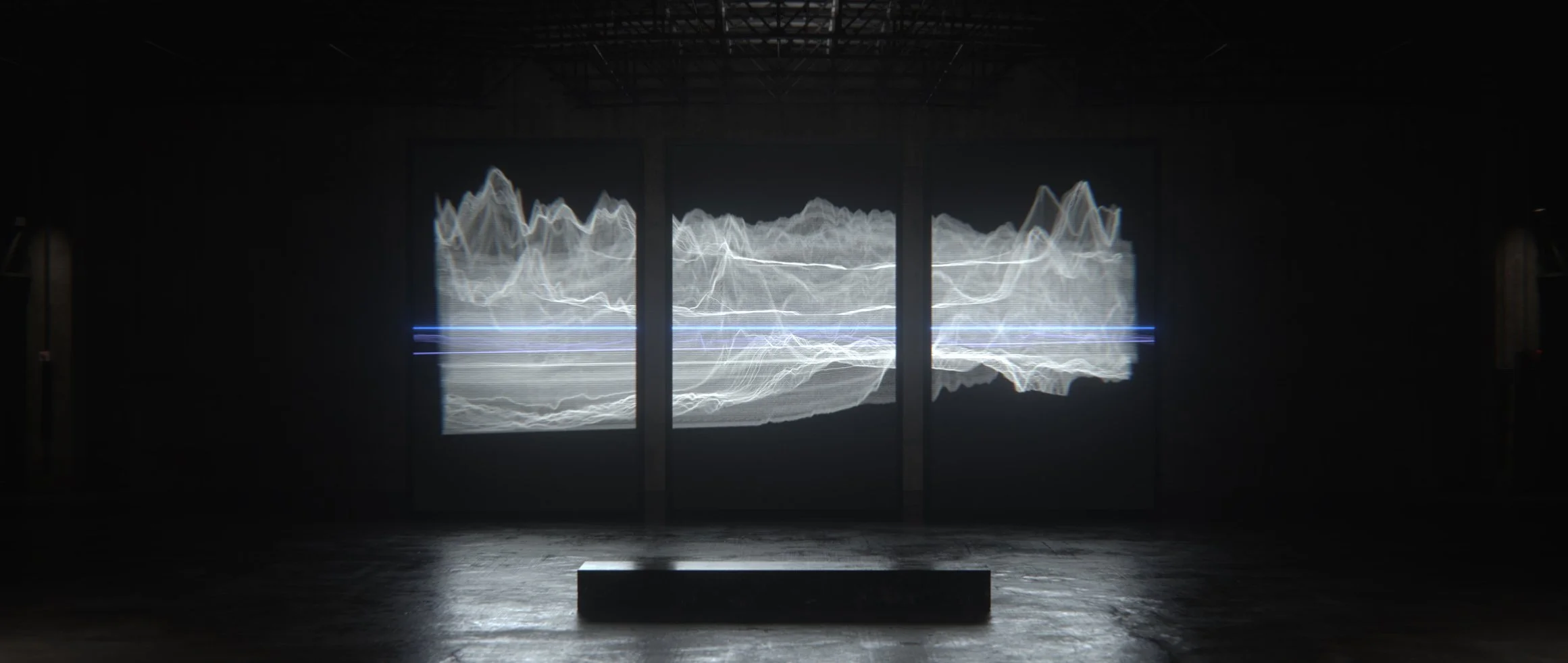
Precision engineering, shaped through time.
The RD#2 film explored the relationship between precision engineering and the passage of time.
Working across conceptual direction and visual development, Neil helped define the project’s visual language, translating Audemars Piguet’s commitment to craftsmanship, innovation and refinement into a cohesive system of form, motion and light.
A central visual motif emerged through the idea of the event horizon, used as a metaphor for balance, precision and control. Positioned between order and chaos, it became a visual expression of the watch’s pursuit of technical perfection within the constraints of time itself.
The resulting language combined atmosphere, geometry and movement to create a visual framework that supported both the product and the wider narrative of the film.
Concept
The event horizon became the project’s central visual metaphor and organising principle.
Its geometry informed composition, motion, lighting and spatial rhythm, establishing a visual framework that balanced containment with expansion, precision with movement.
Through this lens, the film explored time not as an abstract measurement, but as a condition shaped through discipline, engineering and control. The visual language sought to express how technical complexity can feel calm, refined and effortless when brought into perfect balance.
Typography, composition and motion were developed around this idea of tension held in equilibrium, creating a coherent system that connected the watch’s engineering philosophy to the wider cinematic experience.
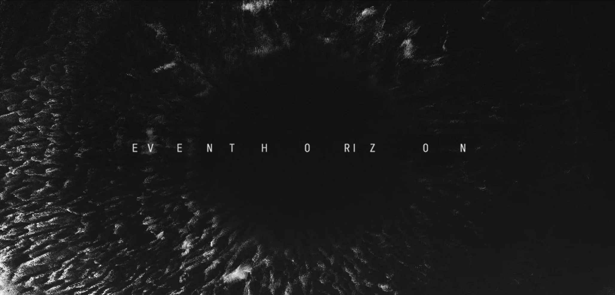
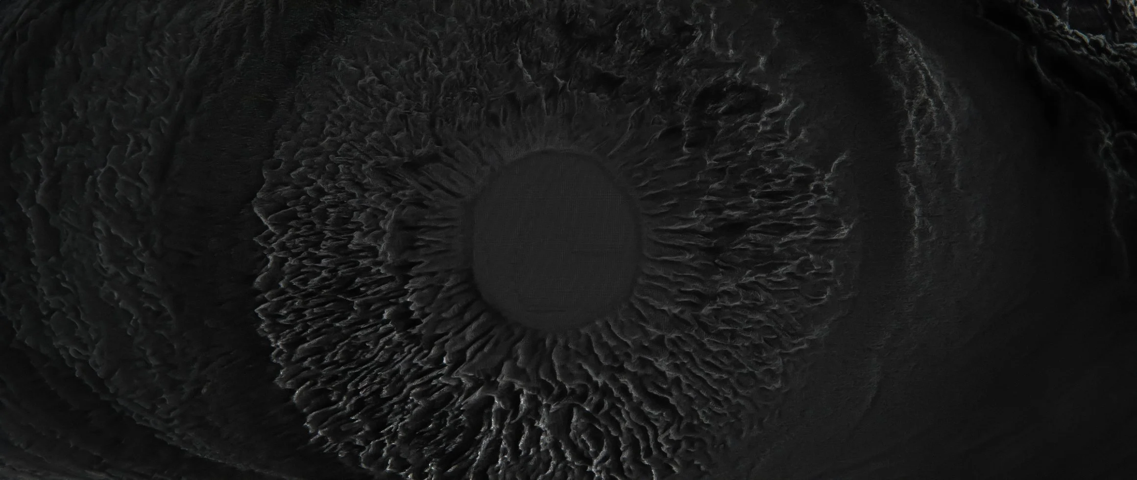
The event horizon became a metaphor for balance, precision and control: a threshold between containment and expansion, stillness and movement.
Cinematic development
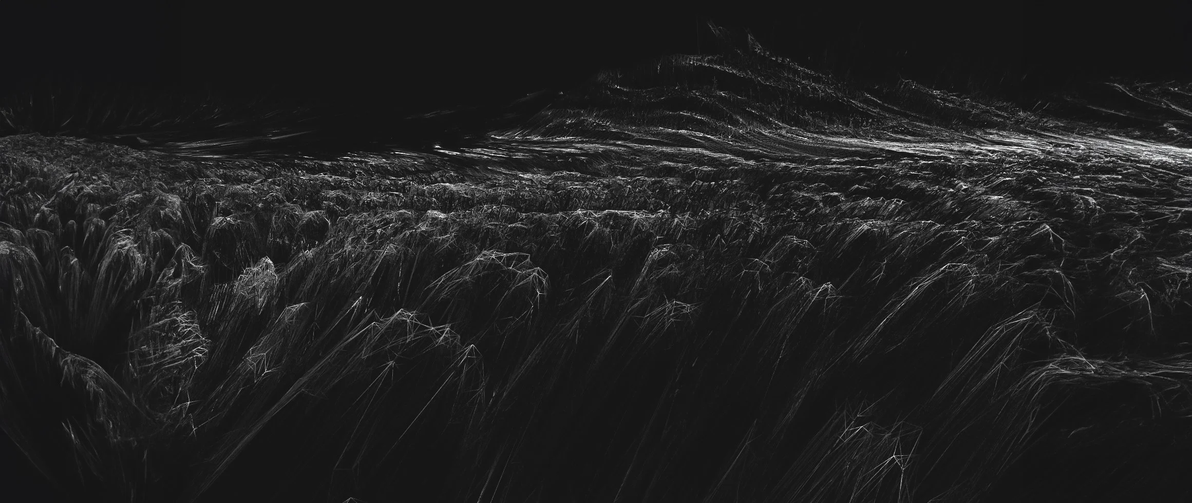
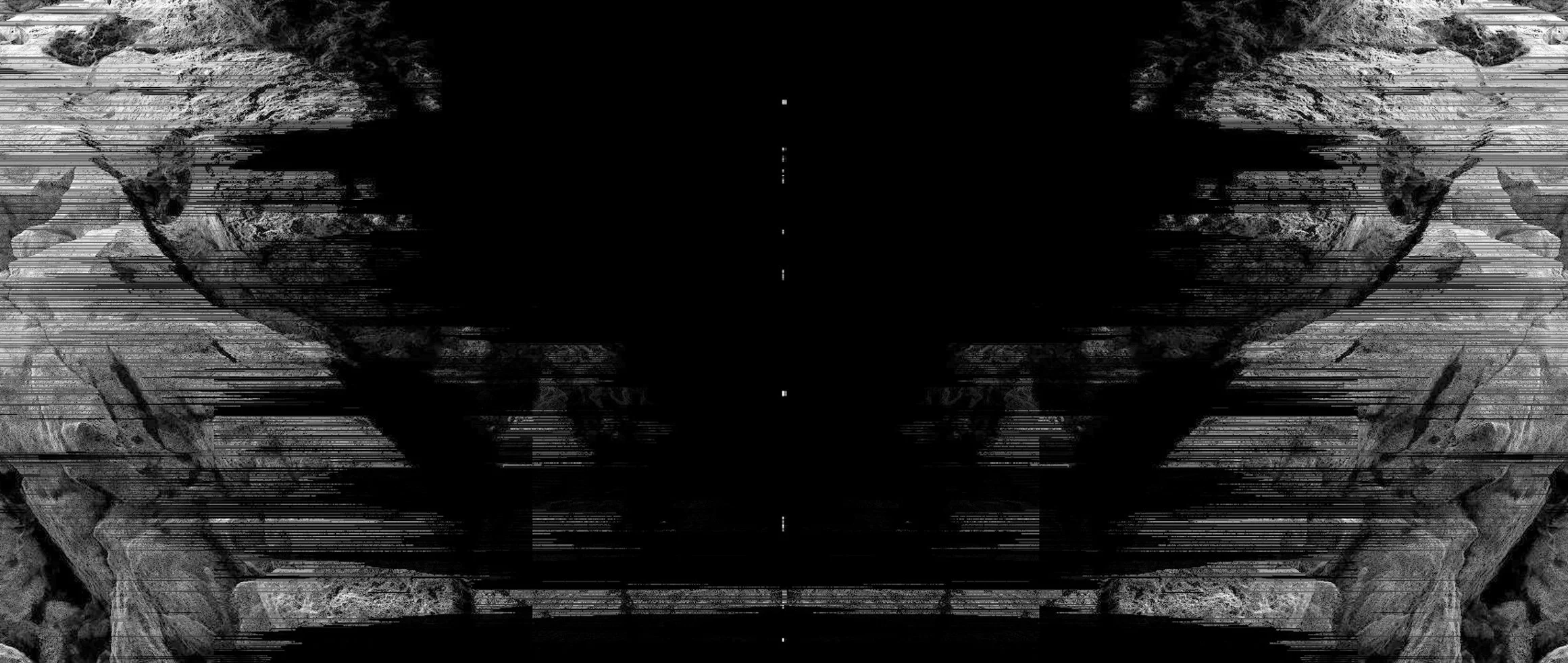
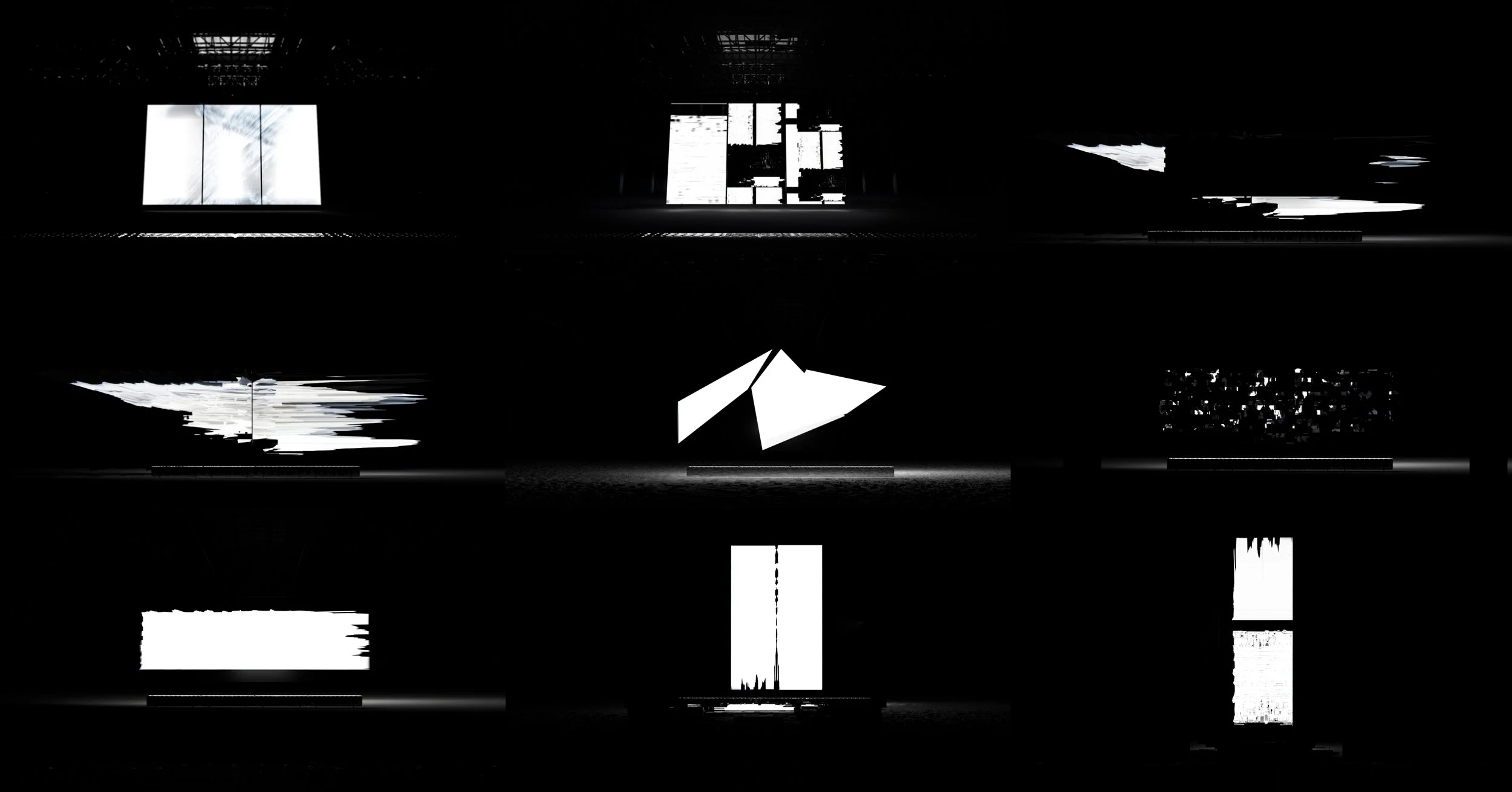
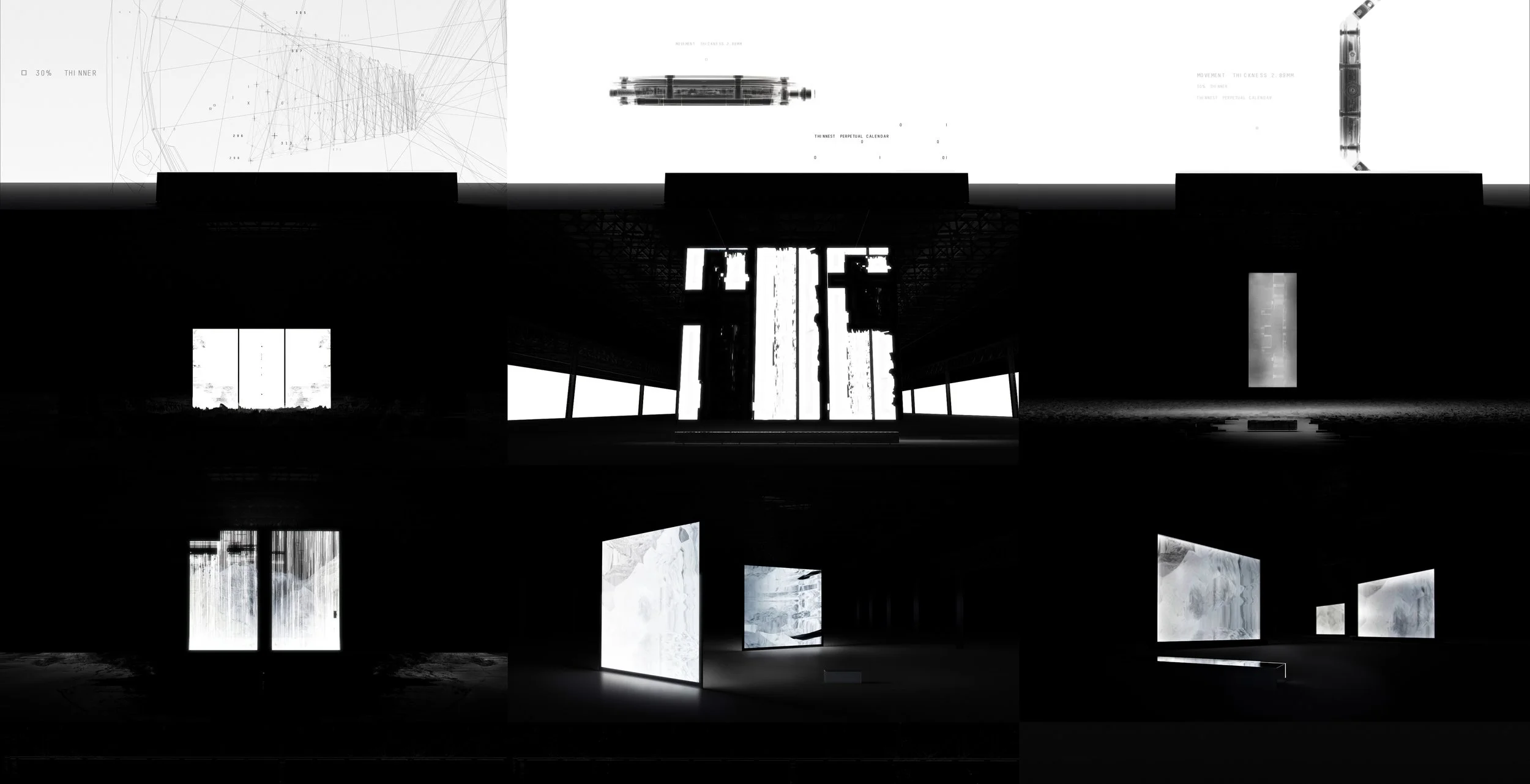
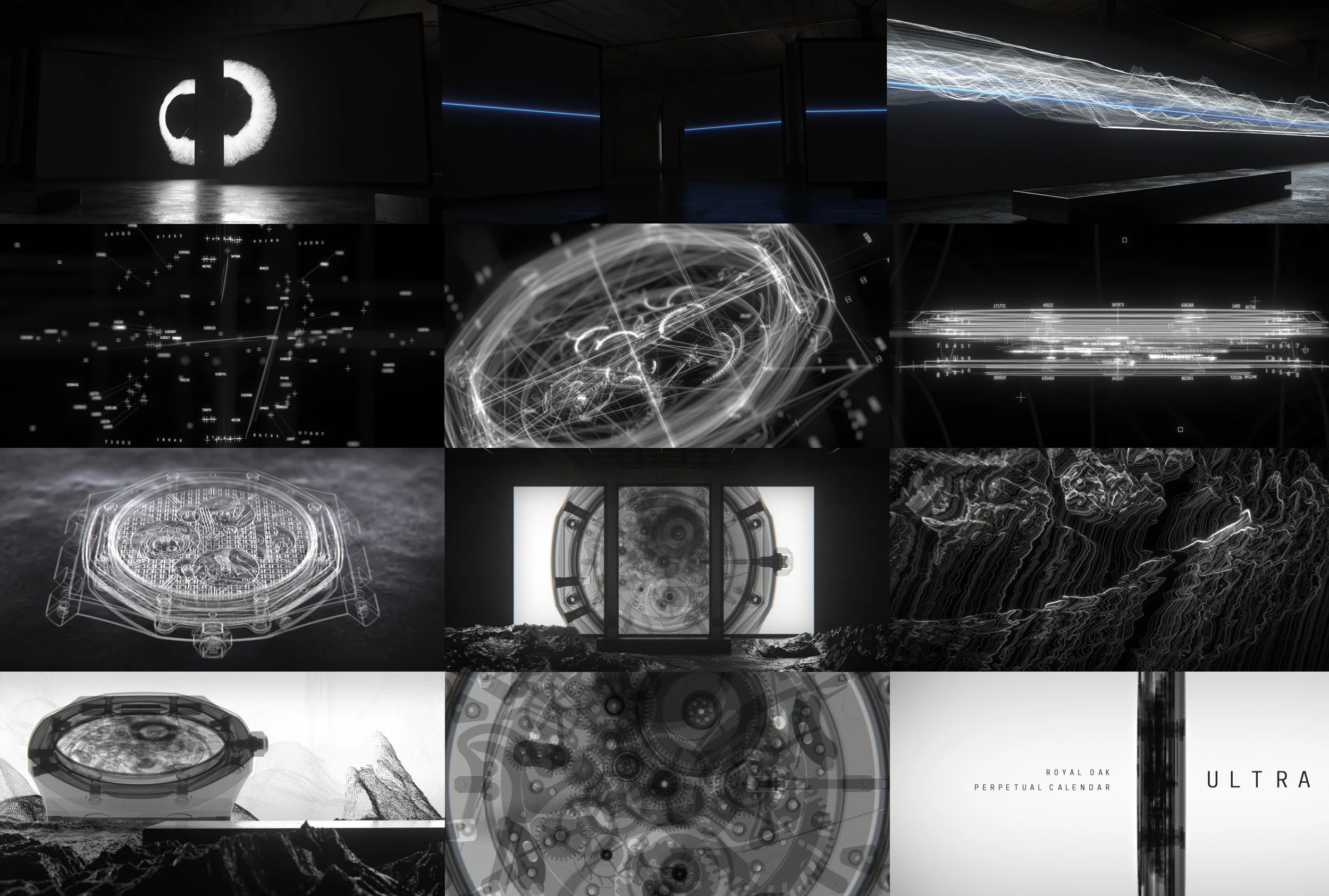
Selected frames exploring scale, atmosphere, spatial rhythm and the movement between material and light.

Visual development · Tone boards
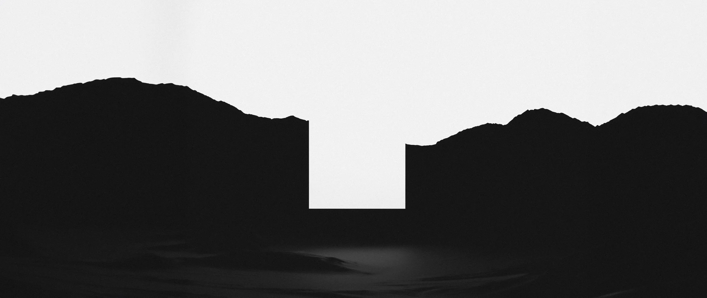
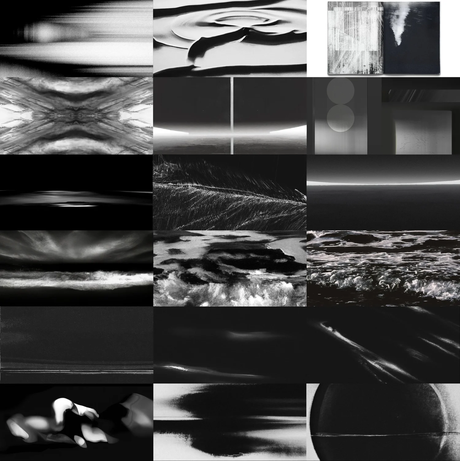
The tone boards explored the event horizon as a visual metaphor for craft, precision and inevitability.
Rather than depicting the watch directly, the imagery investigated moments of tension, compression and transformation, where form appears to bend, collapse or hold itself in equilibrium under unseen forces.
Natural landscapes, abstract textures and controlled voids were treated as studies in structure and pressure rather than representations of place. Surfaces feel dense, directional and compressed, suggesting forces acting beneath the visible layer.
The recurring use of horizons, voids and compressed forms established a sense of controlled gravity, creating a visual parallel to the engineering discipline and temporal authority of the RD#2.
These references formed the foundation of the project’s visual logic, informing decisions around atmosphere, contrast, pacing, composition and typographic placement throughout the final film.
The visual language needed to communicate:
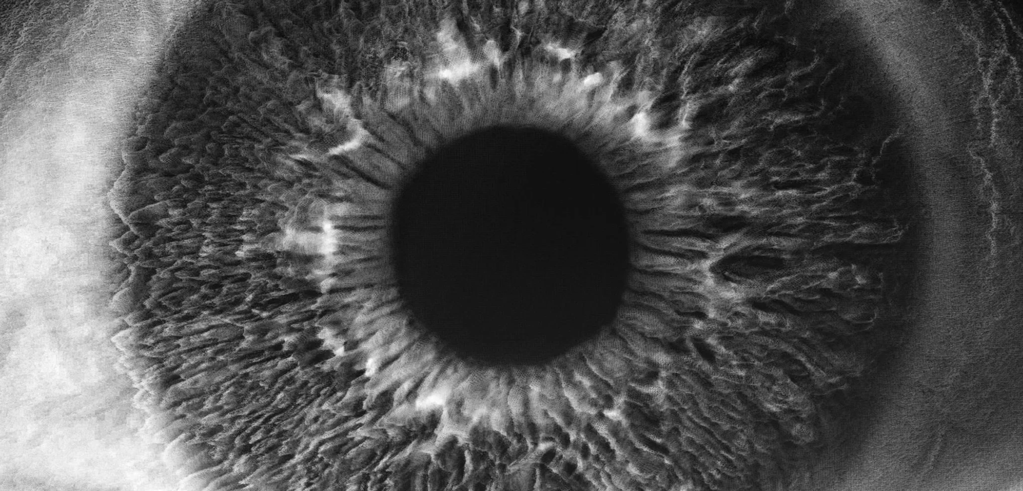
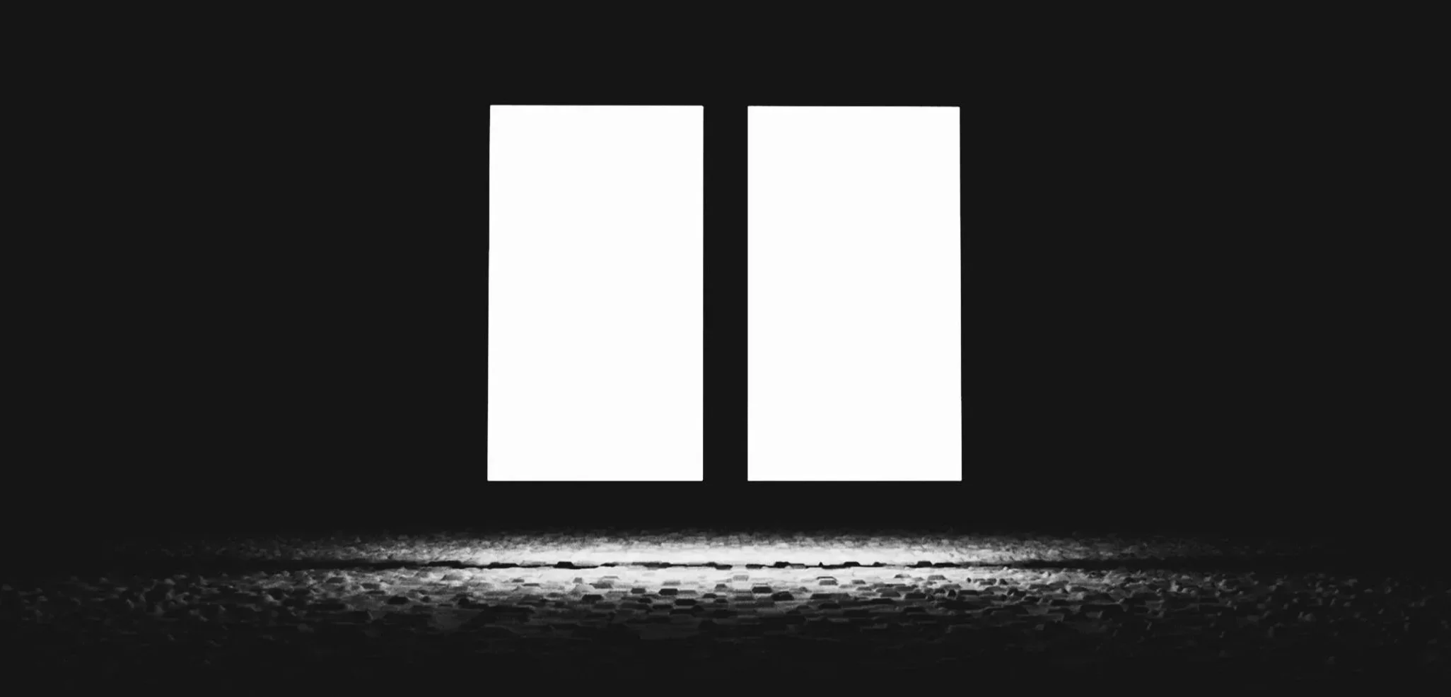
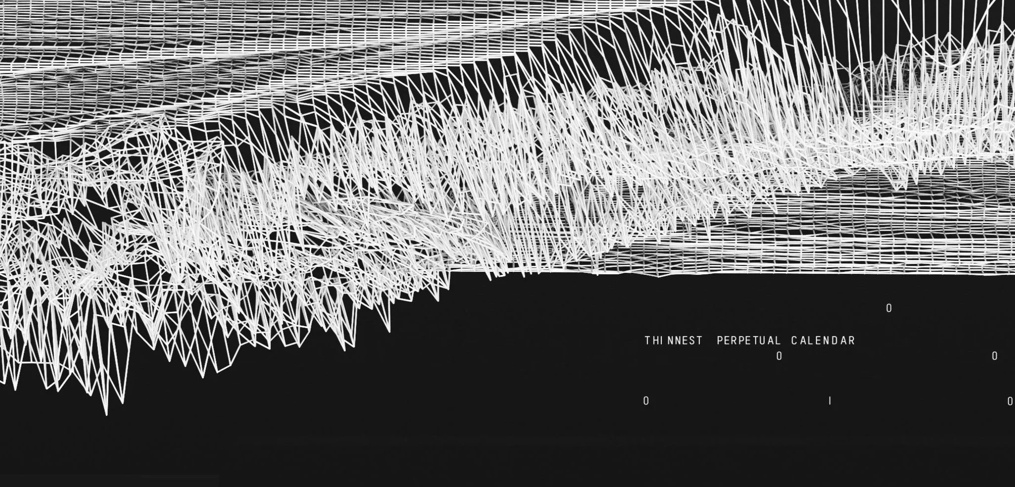
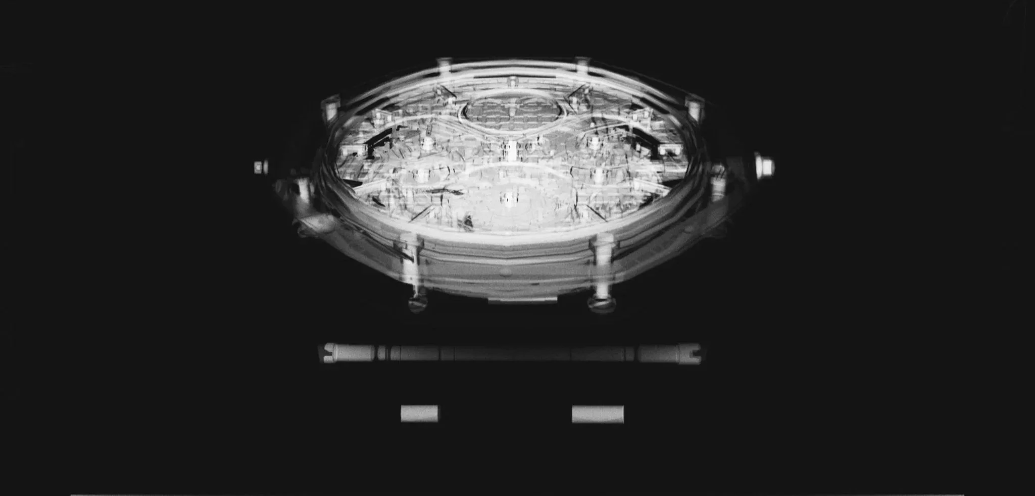
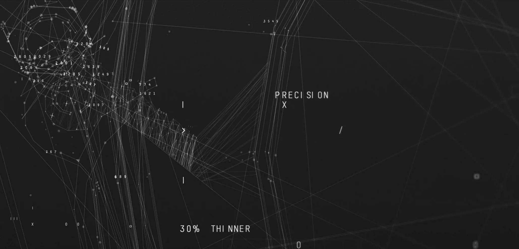
Balanced compositions, restrained use of space and controlled geometric relationships create a sense of quiet authority, expressing technical precision through clarity, proportion and restraint.
Studies in reflection, density and illumination defined the behaviour of surfaces and light, creating a material language that felt engineered, precise and refined.
Tone and material studies
These studies explored visual systems developed for Audemars Piguet, focusing on the relationship between precision, materiality and abstraction.
Rather than relying on illustrative imagery, the work investigated how texture, rhythm, light and negative space could communicate the values of haute horology through a contemporary visual language.
Fractured landscapes, stratified surfaces, wave interference and geological pressure became metaphors for craftsmanship, complexity and control. Light and shadow were treated as structural elements, revealing depth, density and surface tension in ways that echoed the hidden intricacies of watchmaking.
Motion and distortion were used with restraint. Compression, repetition and subtle disruptions suggested the passage of time, mechanical precision and the tension between order and transformation.
The resulting language sought to express luxury through clarity, discipline and restraint rather than ornament or excess.
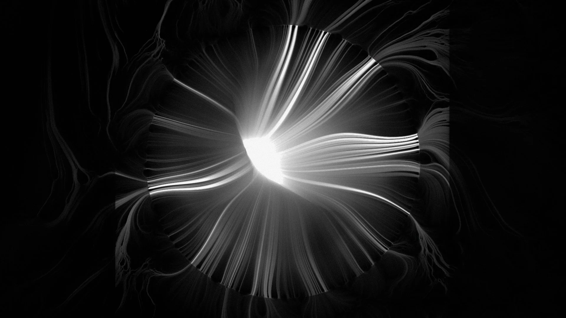
Controlled breaks in the horizon line explored balance, interruption and the measured tension between continuity and precision.
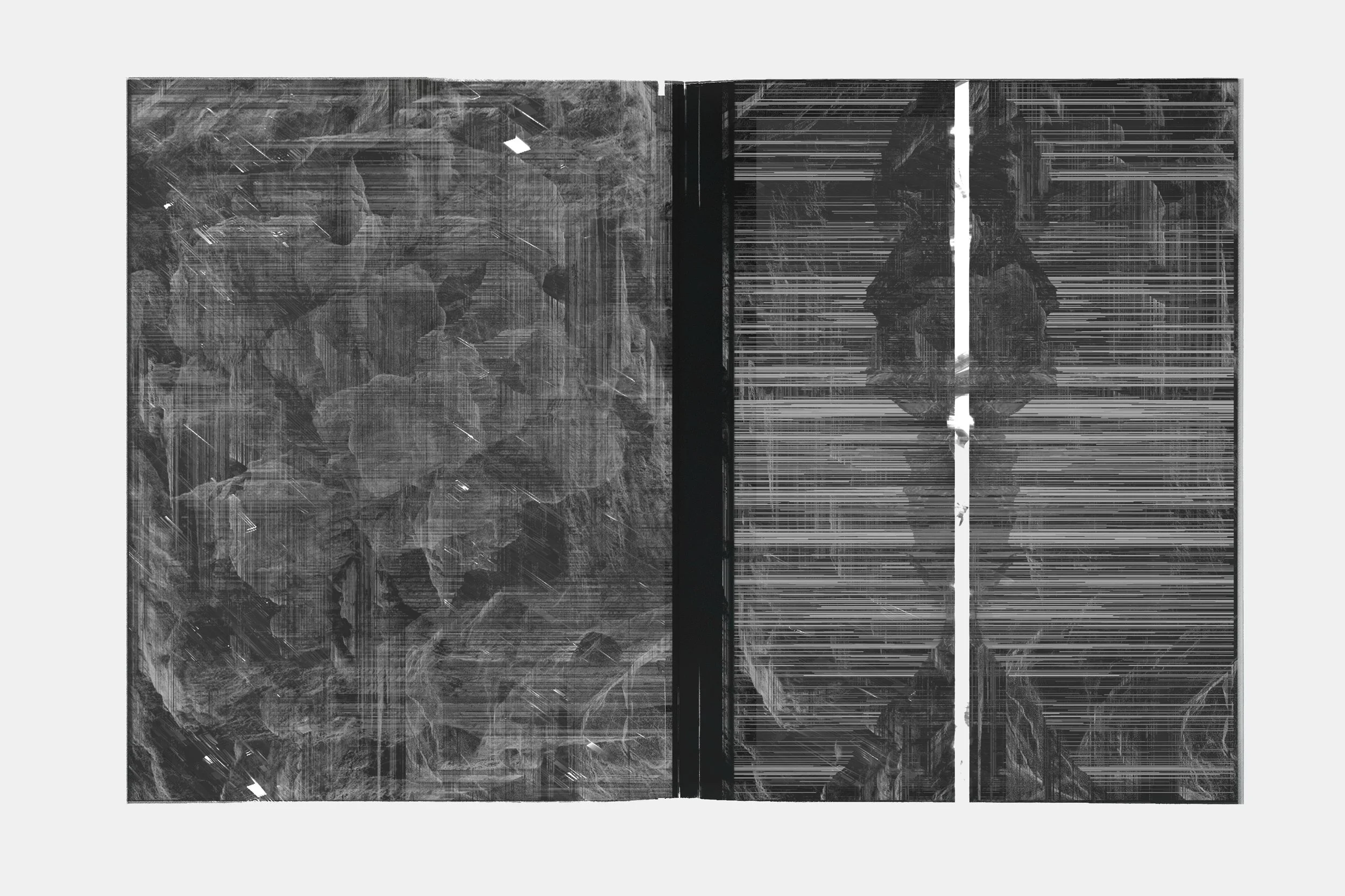
Abstracted surface studies inspired by geological strata and engineered materials, revealing depth through subtraction and contrast.
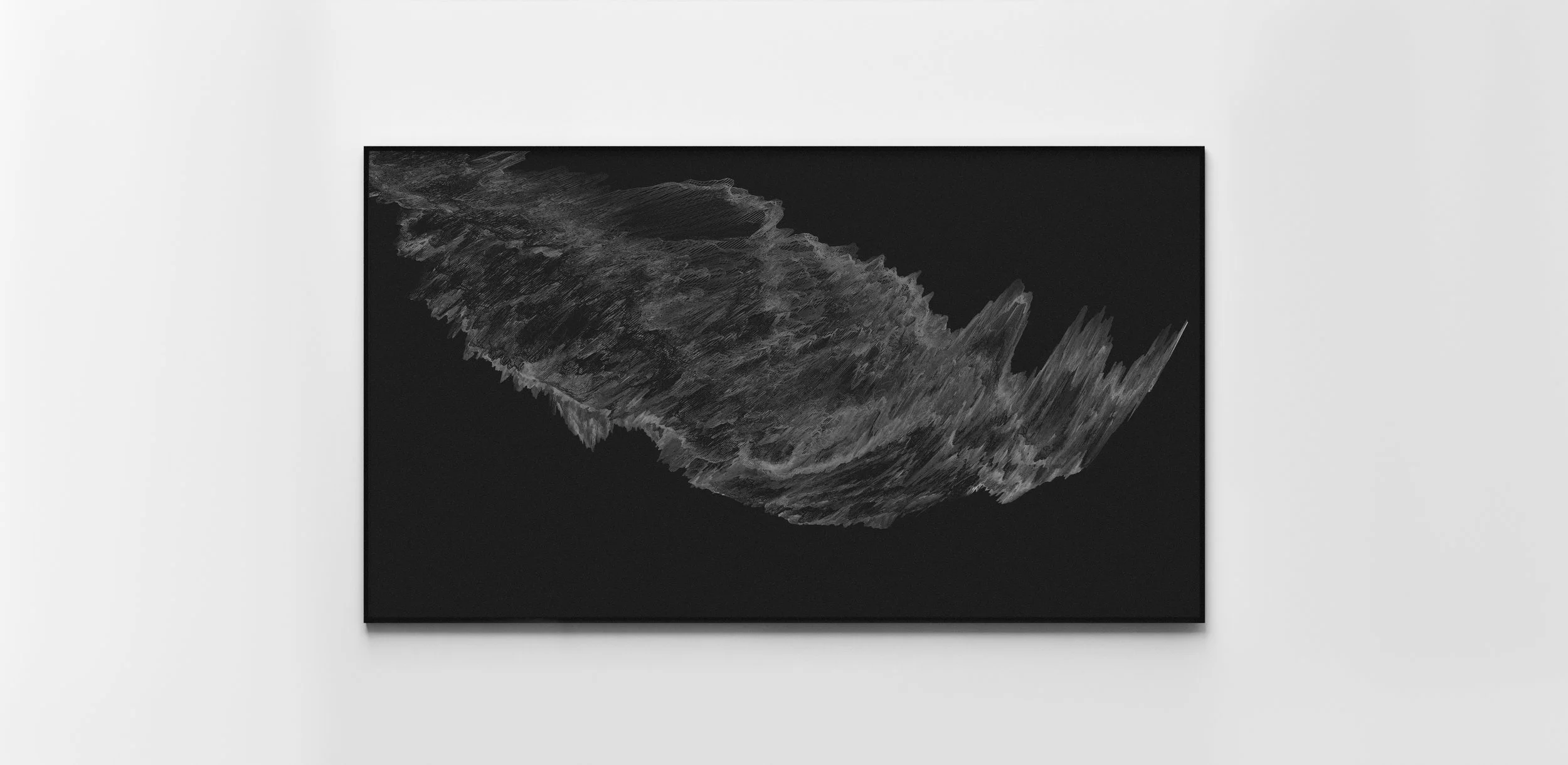
This study explored time as material rather than motion, allowing a static surface to hold accumulated pressure and duration.
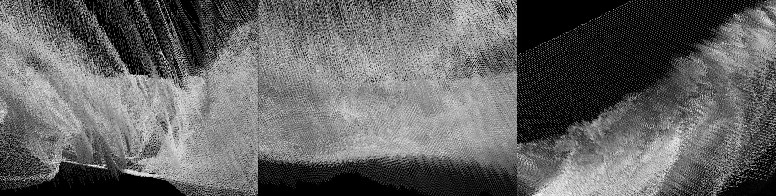
Layered waveforms and interference patterns suggested oscillation, resonance and calibrated motion.
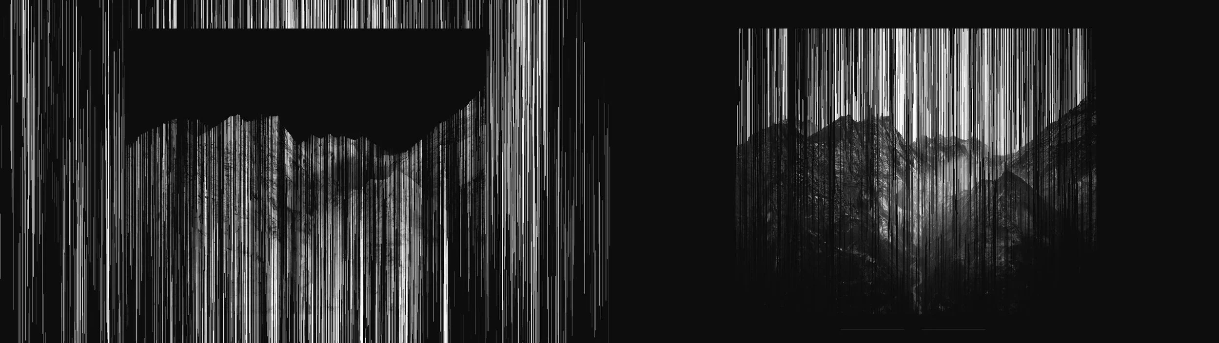
Vertical striations and rhythmic distortions referenced mechanical repetition and the accumulation of time.
Further development studies
Additional iterations retained from the original development process, shown at their complete proportions.
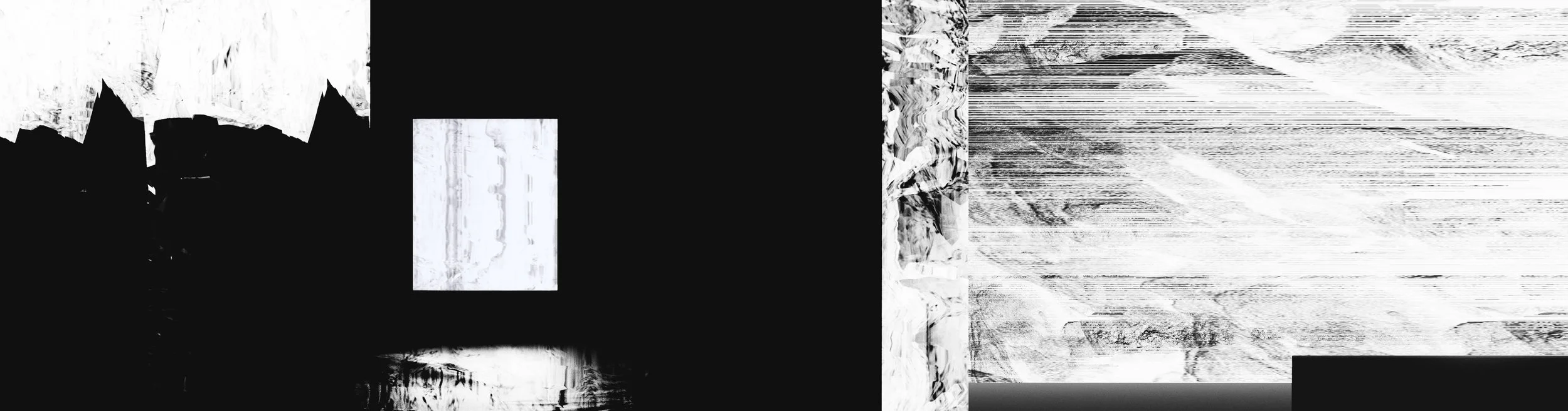
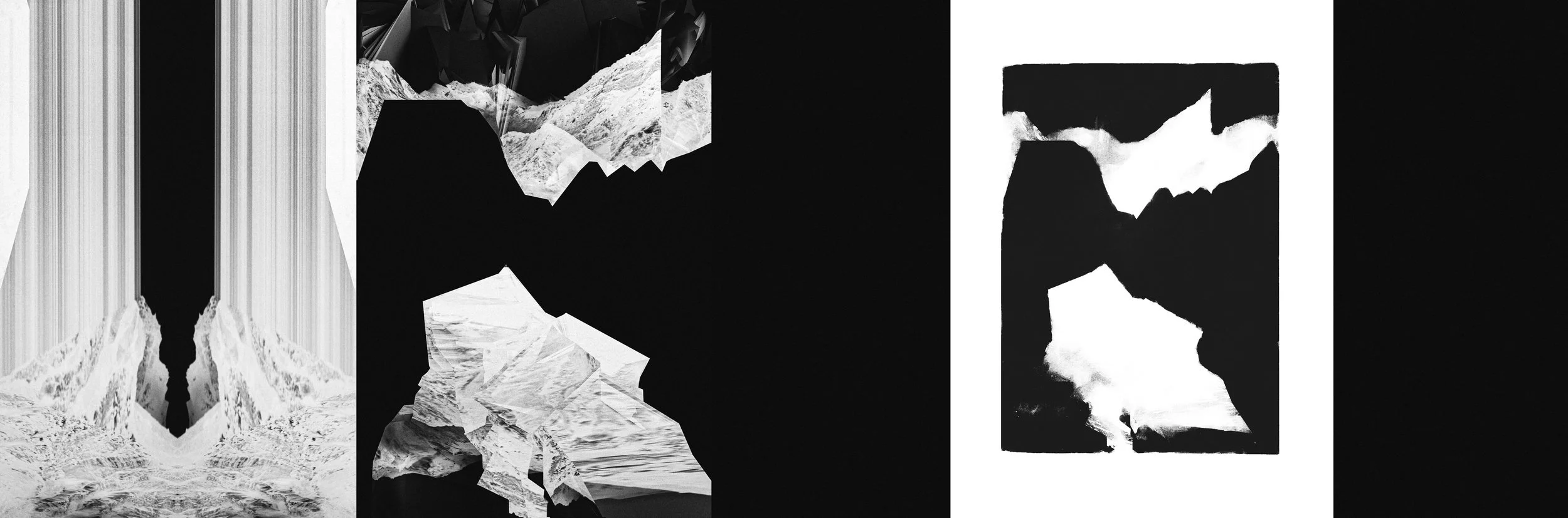
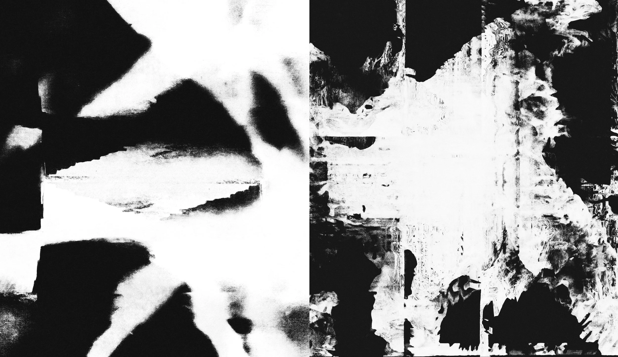
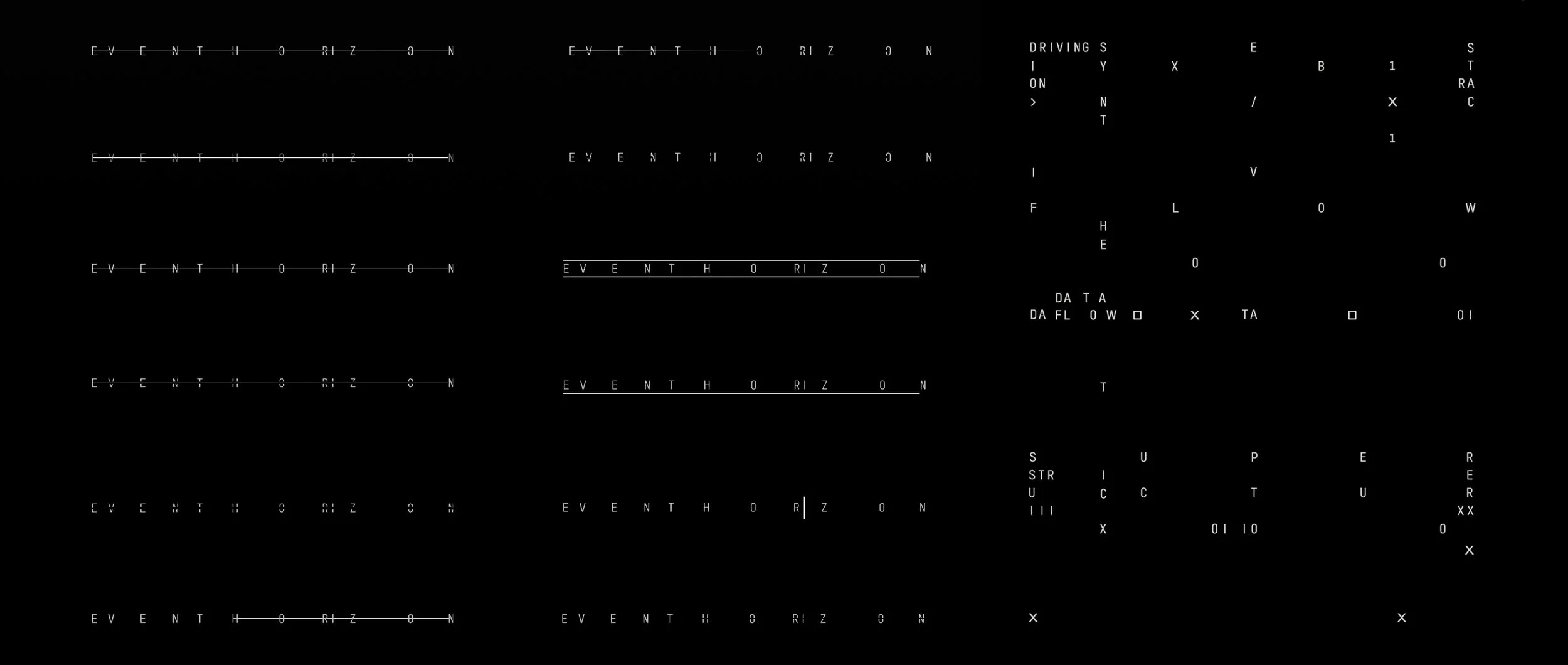
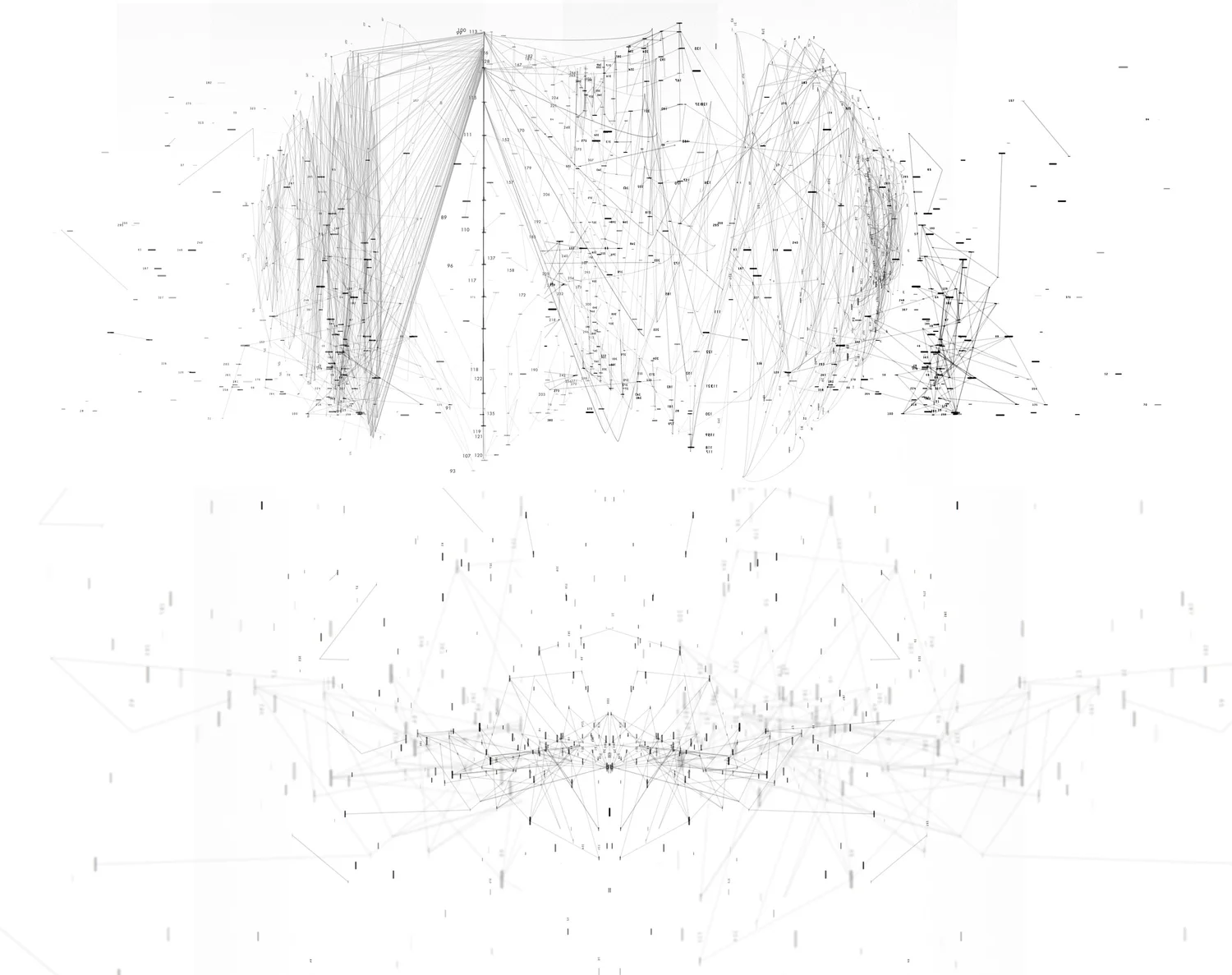
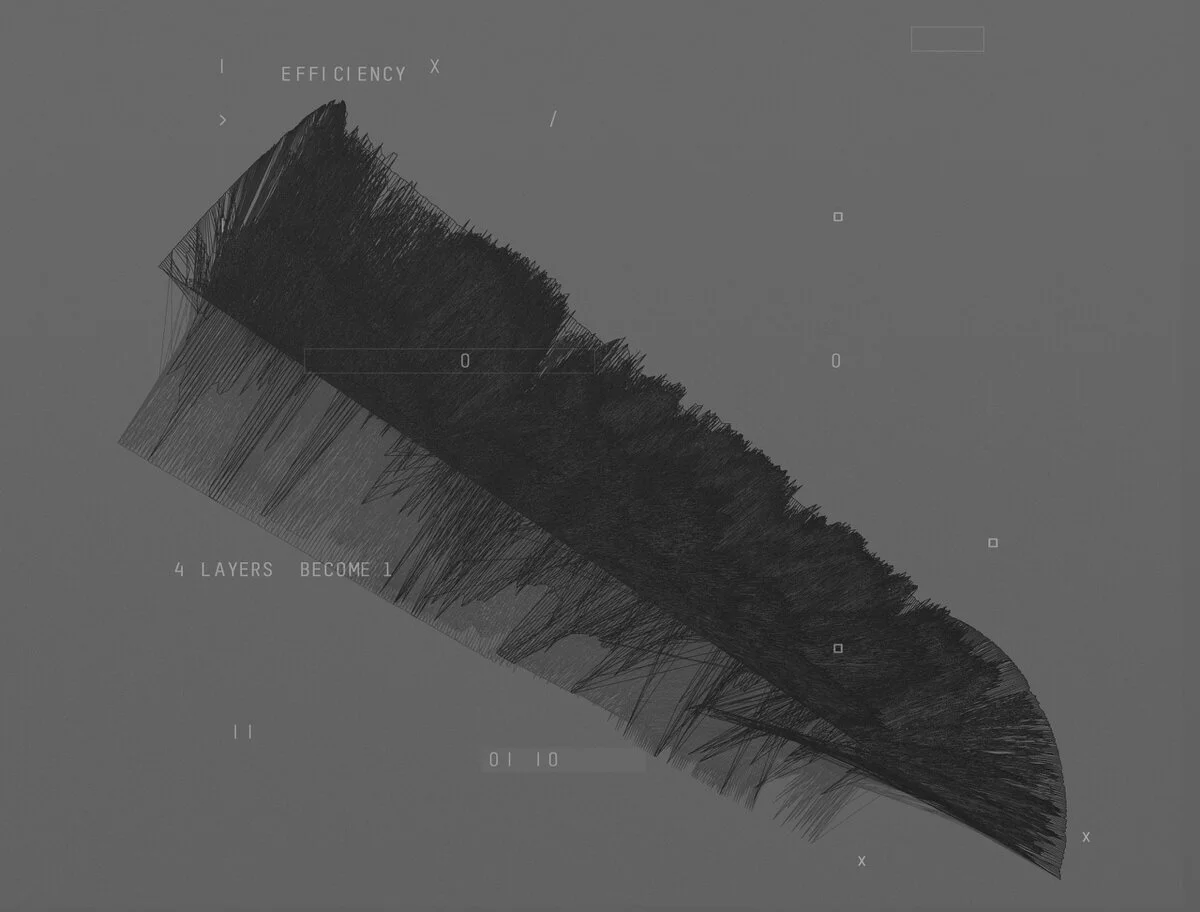
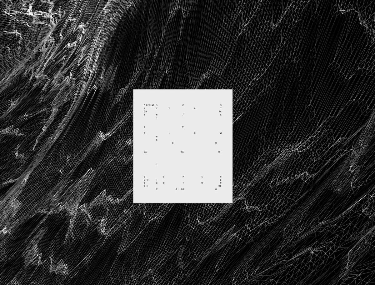
Typographic studies · Graphic motifs
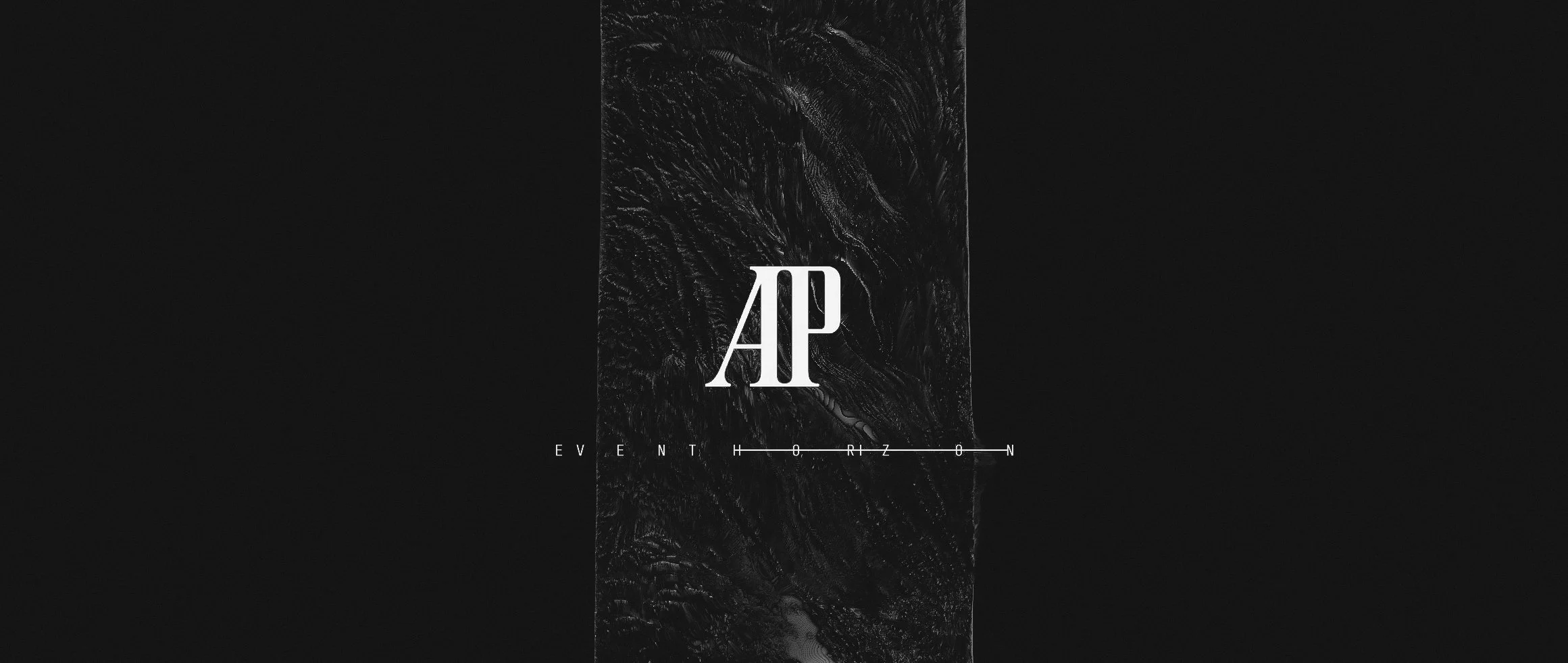
Typographic structure was positioned around the event-horizon form. Letterforms were placed under the same forces as the image: stretched, divided and held across a central line of tension.
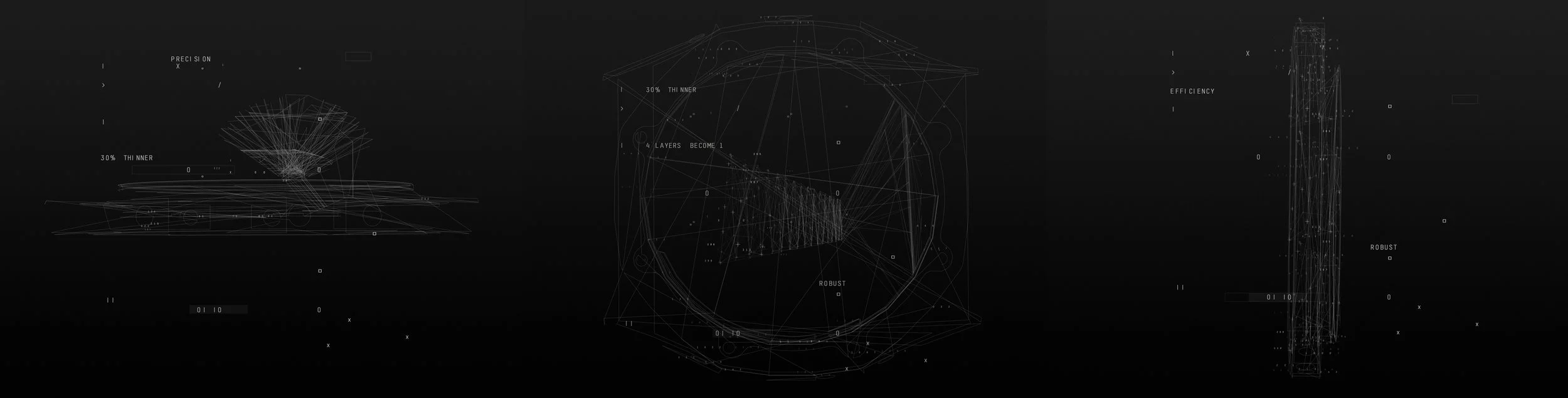
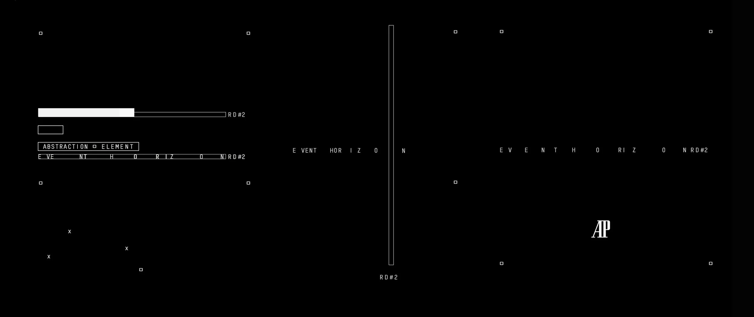
Final production animation
The completed film brings the development language into motion, moving between material tension, spatial balance and the technical precision of the RD#2.
Result
The final ambient film presented the watch as a meeting point between design and physics: precise, minimal and controlled.
Drawing on the visual language established throughout development, the work translated balance, gravity, material tension and temporal precision into a cohesive cinematic experience. Light, composition and motion were carefully orchestrated to reflect the discipline and refinement at the heart of the RD#2.
Rather than relying on traditional luxury cues, the film expressed craftsmanship through restraint, using atmosphere, structure and controlled movement to communicate complexity without excess.
The result was a visual framework that reinforced the watch’s technical innovation while maintaining a sense of calm authority—an experience that felt both contemporary and timeless.
Project credits